Web design plays an important role for brands and professionals in terms of improving customer reach and visitor count. Statistically, 40% of consumers promptly stop using a website if they find the layout unattractive. This is also directed to clients that are looking to hire professionals for your niche.
Therefore, your portfolio website must focus on developing a creative web layout to hold the viewer’s attention. Not just that, your portfolio website’s design should have a good UI design as well.
For example, if you have shown your previous work then the next thing that the visitor might want to see would be your client reviews. So the best UI design practice would be to add a CTA in the bottom of that section “Client Reviews” redirecting to client reviews page or showing client reviews in the next section. It will help to convince visitors that you can be the best person for their project/work. So, make sure that you apply the latest UI design trends while building out your website to make it visually appealing and capable of getting more conversions.
The following are 10 of the best design trends for websites you can choose to adopt.
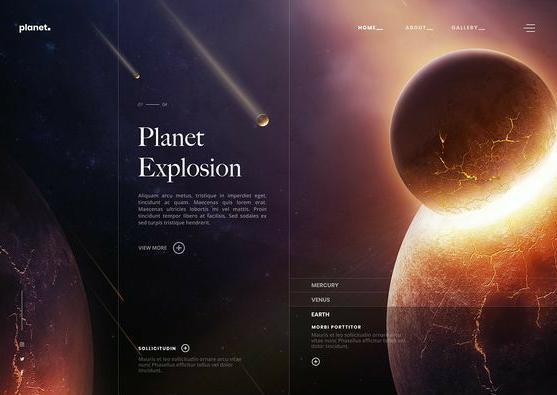
Dark Theme
(Source)
Multiple portfolio websites have a dark theme luxury web design; this suits different OS devices, aesthetics, and UI interfaces. Typically, the dark background pulls the eyes of the viewers towards the main content on the website. Keep the text in high-contrast font and color and add vivid photographs.
Here, the placements of the interface elements can influence the layout composition. Ensure to keep the pictures, buttons, and texts brighter to contrast with the moody dark theme vibe.
Parallax Effects
(Source)
Parallax illusion involves the interface components in the front to move in a quicker motion compared to those in the background. This holds the attention of the viewers more strongly and adds a dramatic feel to the overall theme. Plus, the contrasting background and foreground imagery present an immersive depth impact.
The navigational user experience enhances the quality of your portfolio and makes it look quite professional. However, use it minimally to avoid any discomfort to the eyes of the user. Here, keep the parallax effect in small areas and utilize them sparingly.
Plus, you can add the option of switching off parallax effects as well. Website viewers with vestibular disorders are more likely to continue browsing your website instead of a competitor’s if you give them this benefit.
Layered Graphics
(Source)
Layered effect is one of the many common web design trends that web designers and professionals are opting for in their page layouts. You can add graphical effects to some parts of the portfolio website, like the text or page transitions.
Some websites utilize the technique of transparencies and layered typography. For example, you should keep some of the letters of the main text in the front while fading out other letters in the background of the images.
Spaced Out
(Source)
One of the popular web design trends for portfolio websites included dramatic or strategic space utilization. In this layout type, adjusting the main page elements to highlight the background white spacing is the main goal.
Indeed, with this approach, you as the website creator can highlight navigational points or texts you want the viewer to see. Plus, the white background effect adds a neutral and relaxing feel to the website. This improves the user experience while browsing the site.
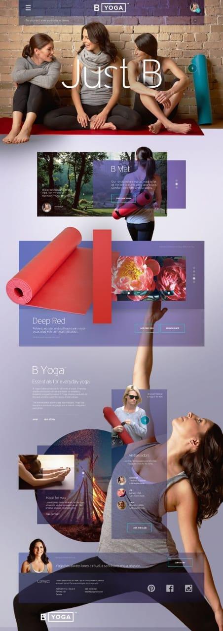
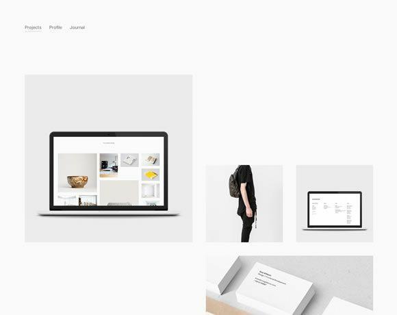
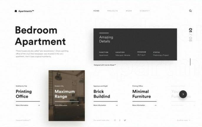
Collage Effect
(Source)
One of the most popular web design-related trends available at the moment is the grid effect. Portfolio website owners can display their photographs in an attractive, organized layout via collages.
Here, the arrangement of the photographs is important to focus on. Plus, designers should make sure that there is at least one interlinking element in all of the pictures to create a consistent flow. For example, keeping them all in grey-scale tone or having the color red in all photographs connects all photos.
Implementing a monochrome, neutral, or dark theme background brightens the grid further in many of the websites. Plus, designers make full use of spacing and effects to enhance the main photographs on the page.
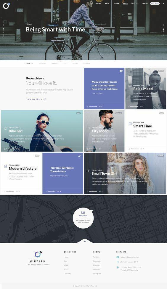
Full-Screen Animations
(Source)
Instead of adding animations to some parts of the screen, many designers prefer making the entire page animated.
Currently, a lot of professionals follow the web design trend of multi-page portfolio websites, with full-screen homepage animation. This adds an interactive element to the overall layout and improves the user experience.
The visitors can utilize the animated elements to navigate to other pages or content. Plus, full-screen animations utilize the factor of asymmetrical components; this adds depth to the overall portfolio website layout to some extent.
To note, how a designer incorporates the animations is subjective.
3D Effects
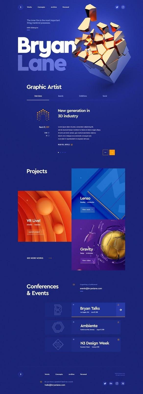
(Source)
Many brands add 3D effects to their portfolio websites for a larger impression on the viewers. The high-definition visuals integrate appropriately with the overall web design and highlight certain parts more definitively. For this purpose, graphic designers suggest not to add the 3D elements throughout the page.
Strategic placement, in contrast, against a minimalist background pulls the attention of the visitors more accurately. Plus, it adds harmony to the overall theme or template of the website. You can also keep the layout colorful instead, with 3D shapes, gradients, or drop shadows for optimal layering.
Minimalist Design Approach
(Source)
This template involves keeping the pages bare, with more white space in the background. Add color and text sparingly, and keep the picture quality subdued. The minimalist style of web design is attractive to viewers for its simple yet classy presentation.
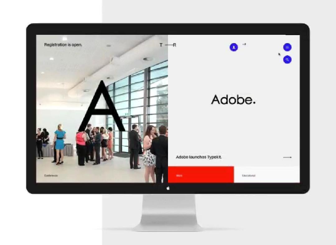
Trendy Typography
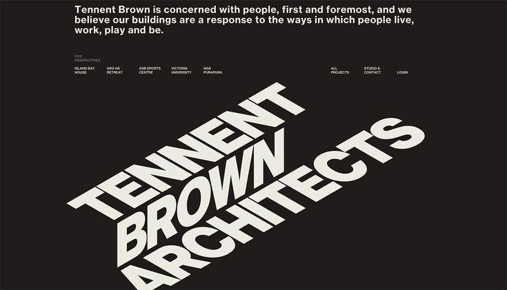
(Source)
This type of web design involves more focus on the typography on the page, generally in a broad and bold font. According to professionals from California website design company, Digital Silk, this type of web design involves more focus on the typography on the page, generally in a broad and bold font. Plus, many designers play with colors for the typeface instead, as the highlight detail of the typography.
Moreover, creatively place the typed text in a side-tilted view or similar style; this would showcase your talent in visual designing as well. Clients focus on attractive and creative typography just as heavily as the picture elements in the portfolio websites.
Muted Colors
(Source)
For your portfolio website, utilize subdued coloring in the background for a more natural effect. Keep the base color in a lighter hue. That would contrast effectively against the main elements your website page aims to show to the readers.
Indeed, use dark block elements for the illustrations or texts. This should draw the attention of the viewer towards the content or other dynamic interface elements. Here, you should add a subtle distortion effect between the muted and bright sections of the web design.
Conclusion
All in all, there are numerous trends in web design that focus on user-friendly navigation, responsive UI, and appealing visuals. These attract visitors and reduce bound rates. Not to mention, adding a competing design to the online portfolio improves a professional or brand’s image in front of the viewers.