Selling products on e-commerce websites maybe not as easy as it sounds. Even if your online store can boast of the visual modernity and aesthetics which attract buyers, these aren’t a guarantee of successful sales.
In e-commerce, user experience (UX) design plays an important role,
if not the most important. A good UX is more than just logical navigation and catchy CTA buttons. But what else?
Here’s a checklist with five actionable UX tactics and 22 small tips that will help your e-commerce website reach its full sales potential. Check if your site provides the listed features and fill the gaps immediately!
Create Intuitive Navigation
An e-commerce site’s navigation should be logical and intuitive. When making a website, pay special attention to the user’s searchability.
Lots of customers come to online stores without any definite goal. They are open to checking out your assortment and buying something new. Alternatively, some buyers may visit your site in search of a specific product.
Whatever the case here, it’s your responsibility to make it as easy as possible for a visitor to find what they need with logical navigation and intuitive search features.
These can be:
- Well-known category names.
- Familiar layouts. Keep it simple: there is no need to reinvent the wheel. Use a common layout that visitors will understand.
- Ability to go back and forth through categories without opening a new tab.
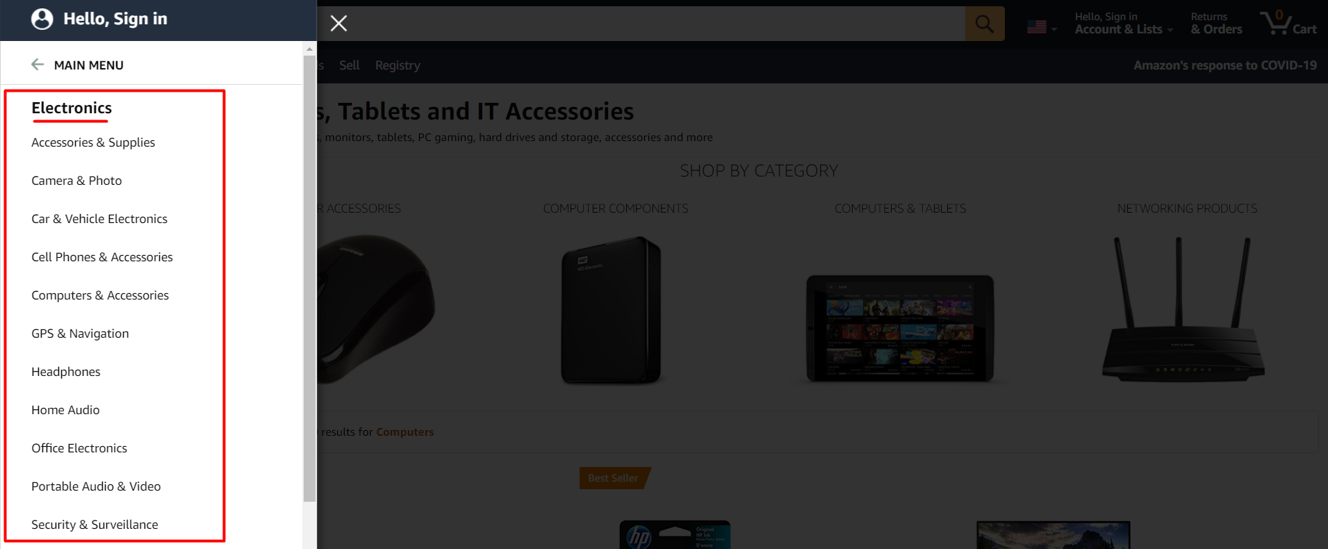
- A dropdown menu with subcategories.
- Labels on the icons designed for mobile users.
Amazon is the gold standard of clear and intuitive navigation with perfectly organized categories and subcategories. Amazon products include Grocery, Echo, Firestick, Amazon Web Services etc.

Convenient Searching
Let’s talk about search functionality in more detail since it is one of the core e-commerce UX elements.
No matter how intuitive your navigation menu maybe, some customers will just skip it altogether and rely on the search engine to find goods. This means you should take special care of the search features on your e-commerce website.
Here are some tips and tricks to help you with this task:
- Implement an open text field box at the top of all pages (a fixed search menu).
- Implement a faceted search when there are over 20 products in a single category.
- Filtering by colour, size, and price are necessary faceted search options.
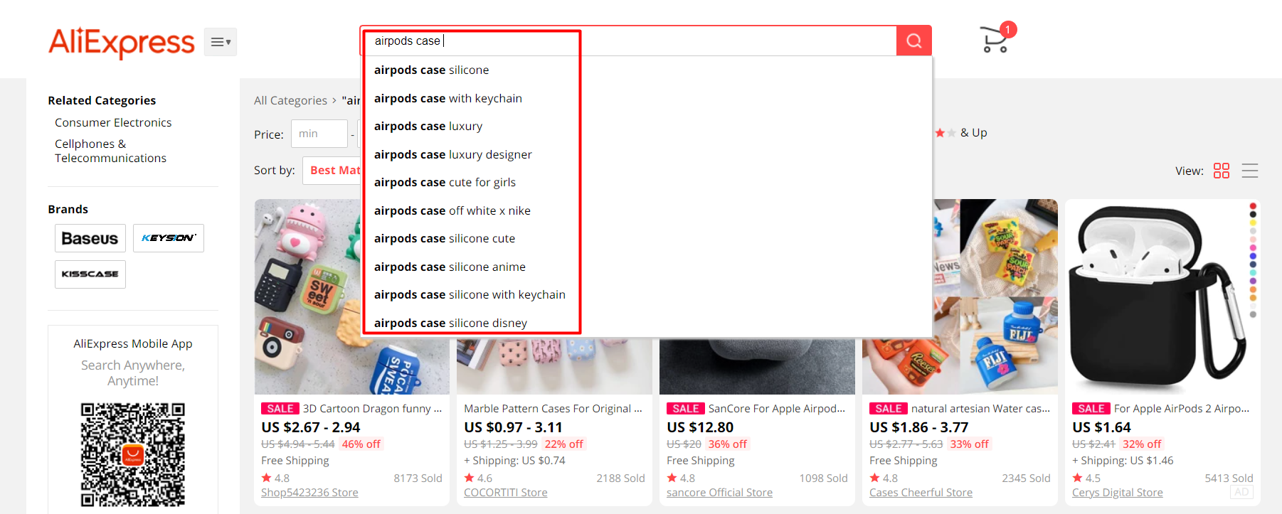
- Don’t use filler text for search input but provide quick suggestions in a dropdown menu.
- Introduce the voice search (VS) possibility and perform the voice search SEO.
See how another e-commerce giant, AliExpress, brilliantly uses all of these advanced search features.

Increase Site Speed
Everyone hates slow sites, especially customers who are in a hurry to buy a product. There’s nothing more irritating than waiting for a website to load. Improving your site speed is the quickest and easiest way to boost customer satisfaction while also increasing the conversion rate.
Start by running your site through the free Google PageSpeed Insights tool, and then you will see what exactly is slowing down your store.
Here’s a short list of the key optimization steps:
- Optimize pictures
Use appropriate image formats for images and ensure that they aren’t excessively large. Reduce the size of weighty pictures with the help of special optimization tools such as TinyPNG, Compress JPEG, or another.
- Minify HTML, Javascript, and CSS
This procedure means”minimizing” developer code, removing any unnecessary spaces, commas, notes, and etc. Your development executor knows what should be done.
- Minimize redirects
Redirects need multiple server responses, and this significantly increases the amount of time it takes for fully loading pages. Redirects are also incredibly irritating from a user experience point of view. Thus, make sure that all of your web pages move the user directly to the destination point. Update your sitemap appropriately.
- Opt for a fast hosting provider
If your hosting speed is slow, there really isn’t much you can do to improve it. So, ensure you pick a fast provider from the start, preferably one with an e-commerce focus.
Pay Attention To The UX Side Of Your Emails
The majority of e-commerce businesses use email marketing as one of the most efficient promotional channels in their marketing strategy. Emails are the best way to communicate with your customers and tell them about your upcoming promotions, new arrivals, special offers, discounts, etc.
To make the most out of your email marketing strategy, you have to pay special attention to the UX aspect of emails. The idea is to organize your emails in a catchy and highly-converting way, motivating users to make a purchase.
Here are a few not-so-obvious UX tactics you can use to leverage your email campaigns:
- Deliver a constant company image
Remember, the emails you send are the face of your brand. Your company image must always be present and consistent. So, before you send out anything, make sure that every email sticks to the unique company’s style.
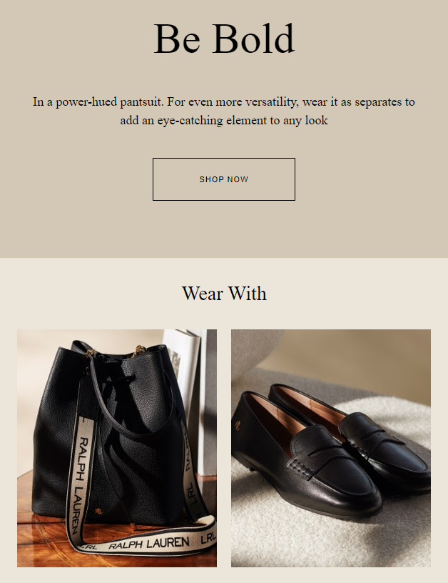
For example, when getting emails from Ralph Lauren, you’ll instantly detect their brand style expressed by a familiar grid, arrangement of elements, and user interface (UI) signs such as fonts, color palette, etc.
 `
`
- Evoke the feeling of urgency
Urgency can become a decisive factor in a promotional email. Phrases like “Today Only” will create a sense of urgency and encourage readers to open their email right away to avoid missing out on a deal. Reinforce this feeling with the appropriate UX elements such as a running timer and catchy CTA button, like “Buy Now” in the center.
- Finish with an emotional sign off
As the last UX element of your email, sign off is no less important than the email body. So, you must know how to end an email in a proper way. Closing an email with a simple phrase such as “bye” is boring and unprofessional. Your customers and potential buyers must feel appreciated when reading the last words, as well as excited to purchase new products. So, put an emotional closing, in terms of words and design.
Simplify Checkout Forms
Cart abandonment is always a problem when it comes to e-commerce sites. This is usually due to long or confusing checkout forms.
Here are several tweaks you can make to improve a customer’s checkout experience:
- Simplify the required inputs
Nobody likes filling in long checkout forms. Just ask for the information that is necessary (contact info, address, delivery method). A little trick – arrange the fields under each other to facilitate the form’s perception.
- Implement real-time validation
Your website should show a green tick next to the form field to let customers know of the information status, instead of only showing errors after they have clicked purchase.
- Enable auto-filling feature
Auto-fill lets customers fill checkout forms with the details they already have stored in their browsers or on their devices, which significantly cuts down the amount of time spent on this step.
- Add user’s email to your mailing list
Ask users if they don’t mind getting emails from you later. Via the email, you can remind users of an abandoned cart or inform them about upcoming sales.
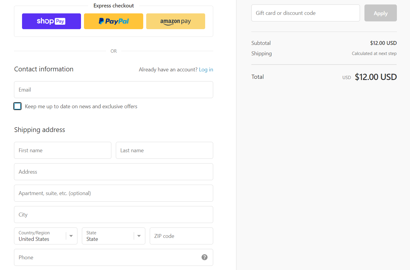
Take a lesson from the Kylie Cosmetics site: their checkout form includes only three simple points – payment method, contact info, and shipping info (application of the discount codes and gift cards optionally). Thus, their checkout process won’t take more than 2 minutes.

Summing Up
“Customer-centricity” is the real trend and top priority of modern businesses. E-commerce is not an exception. So as a UX designer, it’s your responsibility to put yourself into the buyer’s shoes and create a truly customer-centric user experience. Apply our actionable UX tactics and tricks to increase conversion rates and build customer loyalty. You will quickly see results.


