In the present technological age, business is constantly evolving. The digital landscape that existed even five years ago feels ancient by comparison to today’s. Similarly, what business looks like at present will be unrecognisable in a few years time.
This constant evolution may seem daunting when put in this context. But out of this progression comes new and exciting opportunities to enhance the reach and effectiveness of your brand.
Whether it be indulging in influencer marketing, upgrading to the latest in cloud infrastructure, or a complete rebrand, there are myriad ways for you to make your digital business stand out from the crowd.
One of the most effective to emerge in recent times is that of the favicon. Optimizing this small but crucial element of your branding strategy could be the difference between success and failure in the online marketplace.
What is a Favicon?
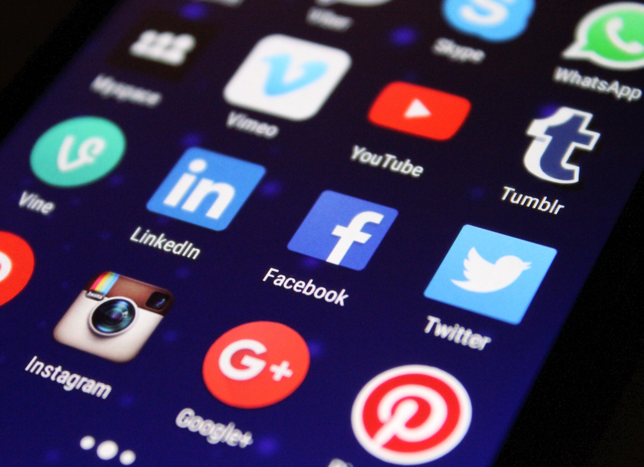
At this point, you’re probably wondering what a favicon is. Well, picture it. You’ve got a great business idea and you want to grow a presence online. You build a website, set up social media accounts, and start creating content to get the word out there. You’re building a client base, but aren’t achieving the brand recognition that you want to.
You visit a competitor’s website for inspiration and notice that, unlike on your site, their tab has a little icon, distinguishing it from everything else in your browser. It’s a logo that makes them stand out from the crowd, builds brand recognition, and – in a time when we have ever-decreasing attention spans – makes them memorable. That little image is a favicon.
(SOURCE)
Caption: Image illustrating what is meant by the term “Favicon”.
They’re easy enough to make and have become synonymous with many brands and websites out there. They’re present in tabs, in Google searches, and in bookmarks, and you recognize that this could be the key to unlocking your business’ potential.
But you don’t know how to go about optimizing this little nugget that could change the fortunes of your online company. It’s a seemingly simple enough thing to change, but getting it right is a difficult hurdle to cross. Fear not, however, as the six handy tips found below should set you on the right path to business success.
Tip #1: Simplicity
Making things simple for your customers is often the key to a lot of good business. Think about how many times you return to buy something on a website that takes ten clicks to order something versus one that takes just two. Or how many times you go back to a site that is overloaded with ads versus one that is sleek and simple in its usage.
Whether you’re making changes to your website’s UX design, introducing new product lines, or improving your business’ cloud integration, how simple something is can often be a defining factor in your success.
The design of your favicon should be no different. This is an easy enough rule to adhere to, especially if the existing logo of your business is simple – like a paw print or a single letter.
But, if your logo is more complex to begin with, consider taking out the distracting elements of its design to ensure the favicon you’re left with is instantly recognizable.
Tip #2: Bold Colors
Ensuring things are simple shouldn’t mean also making them dull. Remember, the whole point of creating a favicon is to be eye-catching. So, unless the existing color palette of your brand is strictly monochrome – or even despite this, in some cases – don’t be afraid to be daring and invigorate your favicon with a bit of color.
(SOURCE)
(SOURCE)
Caption: Favicons with multiple colors are more distinctive than those with only one or two.
It remains important to remember that humans have instinctive reactions to certain colors as well. So whilst being bold with your color choices is wise, try to remain aware of the reaction that certain colors can elicit from your audience.
Tip #3: Correct Fill
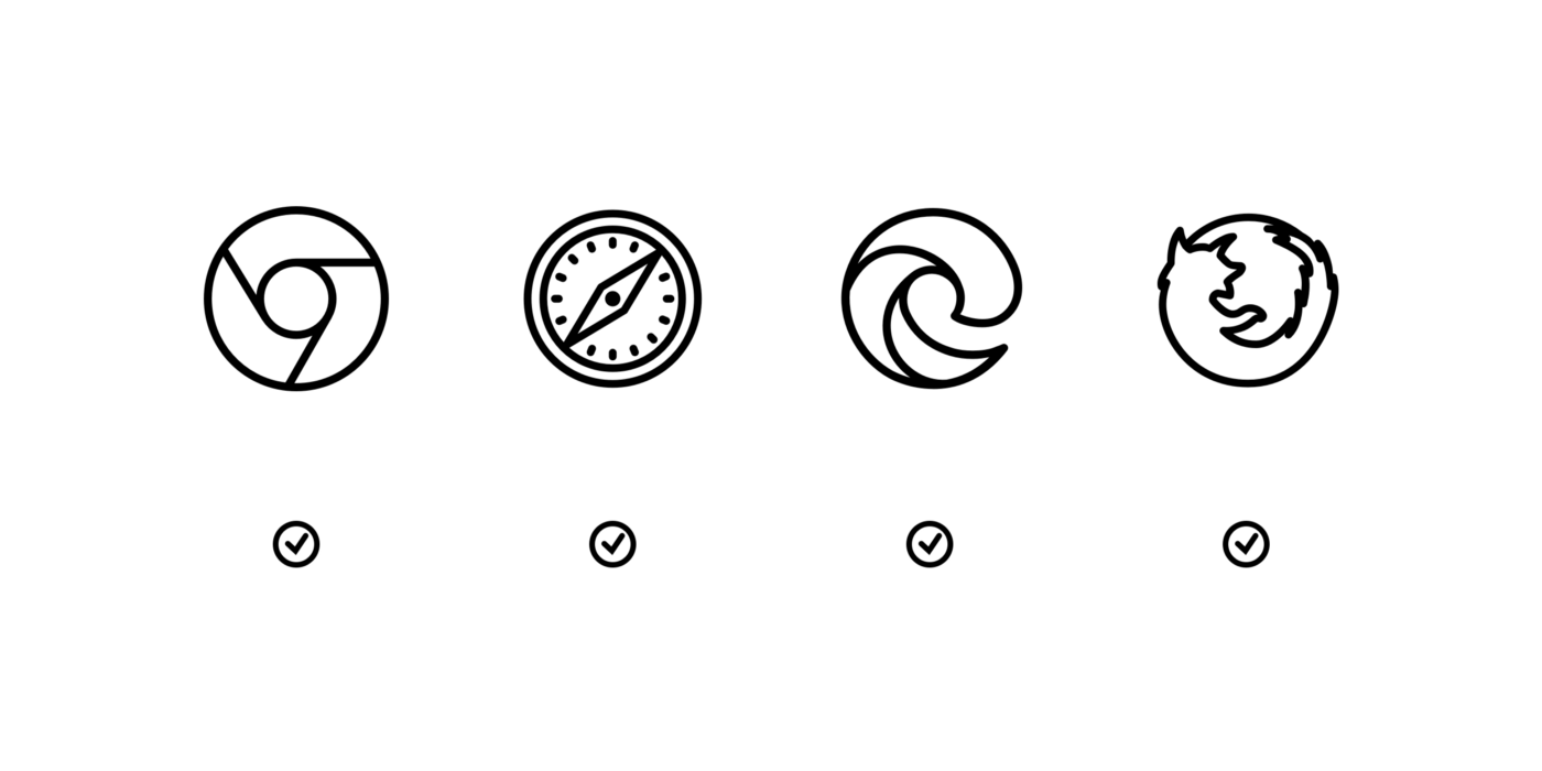
The importance of your color choices highlights an often overlooked element of favicon design: Getting the right fill. Most desktop browsers operate in either light (white) or dark (grey/black) mode.
This is useful to remember when creating your favicon, as the use of a transparent fill in your design may look great against a dark background, but can look washed out against a lighter backdrop, and vice versa.


Caption: Hemingway Editor has a favicon with a light fill, which looks great and is bold against a dark/night mode browser. Against a light/day mode browser, it becomes pale and washed out.
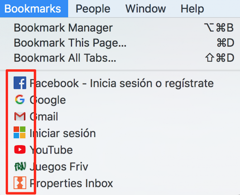
It’s recommended that you create at least two different favicons. One that can be used in your URL and browser tabs, and a different one that can be used for bookmarks and context menus.
At this point, another consideration should be paid to how your favicon looks on different devices. The importance of mobile and tablet functionality for your website is difficult to dispute. So making sure that your favicon translates well across any and all screens is crucial to the success of your overall design.
Tip #4: Correct Shape
Equally important to the size of your favicon is the shape of your favicon. It’s important to remember that the canvas upon which you build your favicon will be squared off. So if you need to adjust from a logo that has a different shape, this should be taken into consideration.
Rounded edges emit a very different signal to logos with sharper edges. How you want your business to be perceived may influence which of these options you incorporate into your design.
Similarly, designs that have too many edges can lack the clarity alluded to above. The design of your logo may be pretty, but when viewed in situ, can become confusing.

(SOURCE)
Caption: Examples of the characteristics associated with different shapes and edges that should be considered when creating your favicon.
Tip #5: Clarity
This one goes hand in hand with simplicity, but with one major difference. When we talk about the simplicity of your design it is about ensuring that no distracting elements of your original logo are included. Clarity refers to the distinction – or lack thereof – of what is leftover.
For examples of clear favicons, social media site Facebook, online transaction site PayPal, and online newspaper The Times are all wonderful inspiration.
But favicons such as the ones used by clothing site Jack Wills, or online music marketplace Bandcamp – whilst simple – are also unclear. Both feature only a single element – a bird in a top hat, a light blue rhombus – but are lacking in both distinction and instant recognition.
TIP #6: Correct Sizing
So, you’ve created your favicon using all the tips above to guide you. You’ve uploaded it to your site and made sure that it works across all devices and many browsers. As you’re checking it, you realize that it looks unclear, almost pixelated. The reason for this is that you haven’t considered the size and the resolution of your favicon.
When they were first introduced into browsers at the end of the last century, favicons existed at a standard 16×16 resolution. As technology across all areas of business has progressed – imagine what a predictive dialler or a gif creator would have looked like to people back then – so has the necessary resolution of favicons. Now, different sizes work best on different browsers and even different devices.
If you’re launching an app for your site, for example, the iPad home screen requires favicons at 72×72. For Google Chrome’s online store, it changes to 128×128. Before launching your favicon, make sure that you have the correct optimization across all your locations.
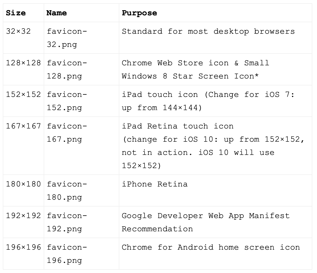
(SOURCE)
Caption: A table illustrating some of the different dimensions needed for Favicons across different media and devices.
Conclusion
Overseeing all this and ensuring that all these tips are adhered to may not be straightforward. It’s hard to fathom that something so small can have such an impact on the success of a business, and take up as much time as it does.
Project managing digital design, much like being a cloud engineer or an event coordinator, has become a much more important and all-encompassing role in recent years.
But getting this right – along with logo, UX, and marketing design – can change the fortunes of your business. If you can produce something genuinely recognizable and unique in the design of your favicon, your brand recognition, and thus your returning customer base, can improve drastically. And if you stick to the helpful advice above, you may well be the next company to take off.
Bio:
Marjorie Hajim
Marjorie Hajim is the SEO Manager for EMEA at RingCentral, the leader in cloud architect technology that provides VoIP and video conferencing services. She develops and executes strategies for short-term and long-term SEO growth. In her spare time, she loves reading books at coffee shops and playing with her dogs.