Color is everywhere and it can make even the dullest of things interesting. It is a major factor in how we give meaning to what we see, as the brain can process visual information 60,0000 times faster than text.
In addition to being an enhancer, colors can influence emotion and behavior too. Your choice of color can captivate potential customers and drive conversions. To better gauge how color can be used to a business’ advantage, marketers turn to a study called color psychology.
The foundations of color psychology have been heavily used in crafting successful campaigns, including in email marketing.
How are color psychology and email marketing related?
Color psychology is the study of how colors can affect the way people feel and act. Marketers study color psychology to learn how to captivate customers and increase sales. Color’s impact in molding the customer experience is so significant that 90% of snap judgments about products are based on color alone.
For email marketers, color and design are critical to a campaign’s success. They are the first thing subscribers see upon opening an email. They should, therefore, make a good impression. However, the window time to make this impression is relatively thin as people only allocate around 51 seconds to an email upon opening.
A poorly designed email runs the risk of getting ignored. On the other hand, a visually appealing email can urge subscribers to read through its contents and, hopefully, engage with the brand. Avoid disengaging leads by harnessing the power of color psychology and using color in emails.
Using colors in emails? 7 ways to get it right
A lot can go wrong when designing an email. It’s not as easy as splashing a striking color here and there—you should use color in your email strategically to make an impact. Convert leads swiftly and effectively by employing these tips to use colors in your marketing emails.
1. Simple and clean designs
Less is more. Nowadays, marketers are jumping into the minimalist design trend to create a bigger impact. That is because 81% of marketing emails are opened on mobile devices with limited space to capture customers. Mobile responsiveness can make or break an email campaign. A study by Wow Local Marketing found that 52% of customers are less likely to engage with a company because of a bad mobile experience.
A simple design is achieved through content prioritization.
Remove all the clutter or unnecessary design elements and focus on highlighting the important information in your email. Good use of negative space or empty space can also be helpful. Negative spaces can bring visual relief to an email and can help it look cleaner.
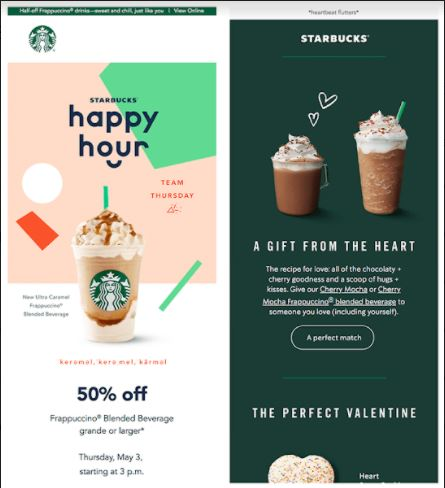
Source: Simplilearn
A great example of a simple and clean design is this promotional email from the famous coffee chain Starbucks. Notice how it brilliantly uses negative space to highlight the written contents of the email. It also incorporates pleasing colors that do not overpower its general design. Everything is refined and straightforward, just how a good email campaign should be.
2. Bright colors to make content stand out
Just because your design is clean and simple doesn’t mean it has to be dull. Make good use of bright colors to make your content stand out. That is especially helpful in highlighting your email’s CTA (call-to-action). A CTA is the second step in the conversion process. Your email’s content and design should all be designed to make subscribers click on your CTA.
Using a bright color can make your CTAs pop. Red, in particular, is an effective driver of action as it gives readers a sense of urgency. A study by Hubspot saw a 21% increase in conversions when a CTA button is colored red. With this in mind, always remember to emphasize your CTA buttons and important content by choosing colors that stand out.

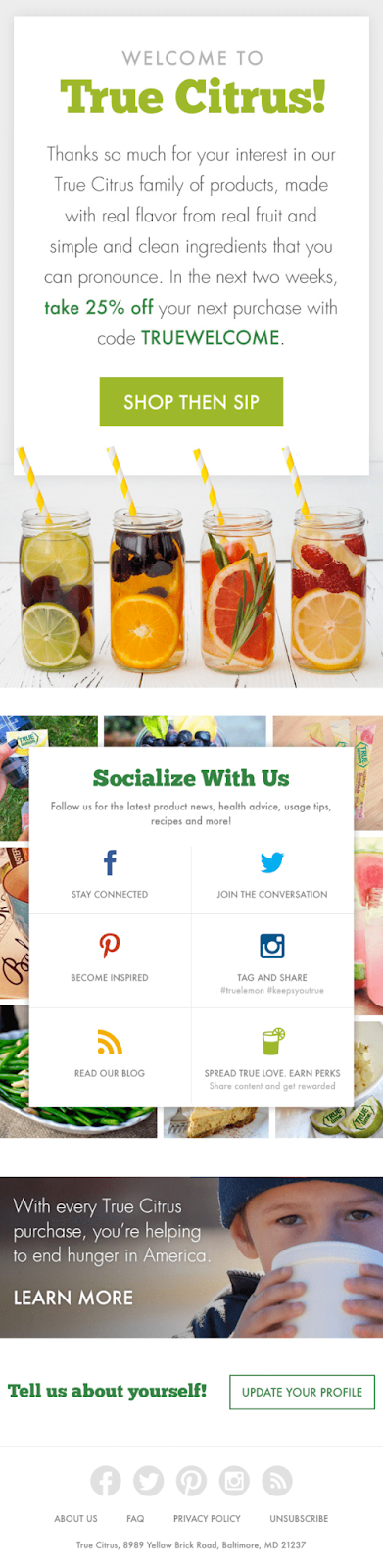
Source: SendinBlue
In this example, True Citrus beautifully uses the isolation effect to highlight the CTA. The isolation effect states that an item that differs from a pool of multiple identical objects is likely to be more remembered.
Here, True Citrus uses different shades of green contrasting with the email’s white background to emphasize the brand name, the CTA, and even buzzwords such as “take 25% off.”
3. Use colors for ALT text
A lot of research and brainstorming goes into designing one email to ensure its effectiveness. Every email sent should carry a potential for converting customers. That doesn’t just mean making your mailing list undergo the process of email verification to weed out the invalid emails. It also means looking at how your email will be displayed in a particular inbox.
Some emails may face image viewing restrictions or slow image loading time, making them appear as ALT texts. ALT text or alternative text are short descriptions of an image that usually appear when an image cannot be displayed.
Using ALT text is a common SEO practice in optimizing your images. You can style your ALT texts by using color, too.
Styling your ALT text with color allows you to match it closely with the actual image. In the example below, the left portion of the image is the ALT text version of the actual email on the right. Styling your ALT text like this makes it look more engaging. Just compare the image with the broken blue link above with the image below.
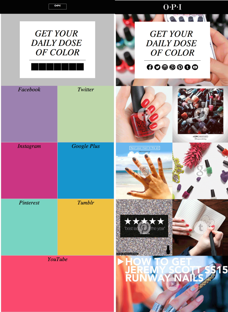
Source: Email Design
You can style your ALT texts by adding code to the HTML that displays them. Although this is an effective solution to save your design, you should still refrain from using image-heavy emails. It’s better to keep a good ratio of image and text in your design to avoid displaying a big block of ALT texts when the actual images won’t appear.
4. Use color to divide your content
Email content should follow a natural progression. From top to bottom, it should present a subscriber’s journey with a series of information. That information can range from company history to products and services offered. With all that in a single email, your campaign may end up looking crowded and ineffective.
Seventy-nine percent of users scan information rather than reading them word for word. To help readers understand your email better, you can separate the information into segments. By using color in emails, you can distinguish one segment from the others.

Source: Hubspot
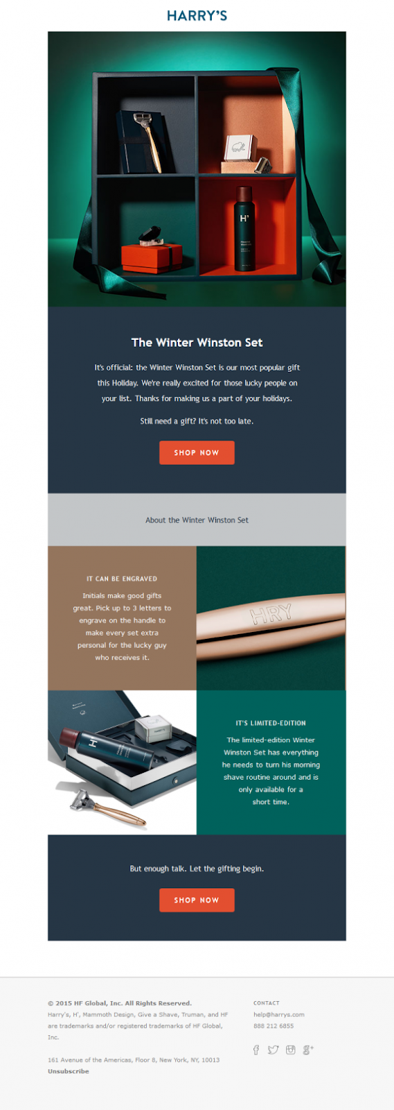
Here’s a good example of scannable content using color.
To promote its winter collection, men’s brand Harry’s separates text and visuals using traditional winter colors of blue, green, and brown. Likewise, your email should be both visually appealing and easy to grasp.
5. Include background colors
While a white background can make an email look lighter and cleaner, a striking background color can bring it to the next level. Some images may not be displayed to some users, but background colors can be rendered across all inboxes using HTML.

Source: Essence of Email
Sometimes, a good email doesn’t require a plethora of colors. Like this example from stationery brand Moo, all it takes is one stunning background color to captivate readers. Following the concept of less is more, it uses shades of turquoise in the background and simple taupe fonts to promote the sale of items.
In choosing your background color, make sure that it doesn’t overpower your images and written content. Everything has to work in harmony to produce a seamless email campaign.
6. Use different colors for your links
Links help customers learn more about your business. It takes the conversation outside the email by redirecting them to relevant pages like your website or social media handles. That can help bring brand awareness and encourage purchases.
These links are often scattered within an email’s content and can sometimes be ignored if they have the same color as normal text. You can use colors strategically to emphasize a link and distinguish it from normal text.
Source: Mail Poet
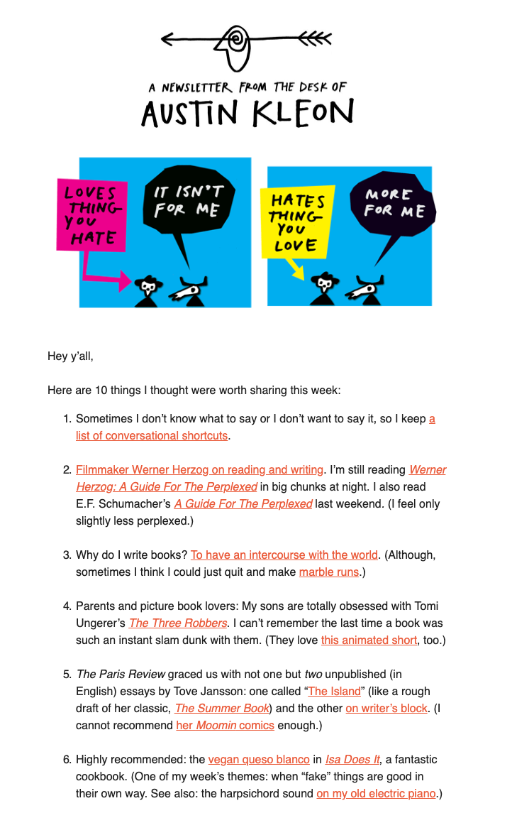
The newsletter above from Austin Kleon uses a bright red color for the email links. Red is a very common color used in marketing as it stimulates urgency. A test found that red increases conversions by 21%. You can use any color depending on your design. Just make sure it stands out from normal texts.
There’s plenty of opportunities to experiment with this strategy. For example, you might use one color for links in your first email and a second color for your follow up email.
7. Have a color scheme in place
If you’re using color in emails, you also help your branding. Many customers associate or remember a particular brand with colors. A survey by Reboot found that having a signature color can increase brand recognition by up to 80%. In designing your email, it’s best to choose colors that represent your brand in the most visually appealing way.

Source: Engage Bay
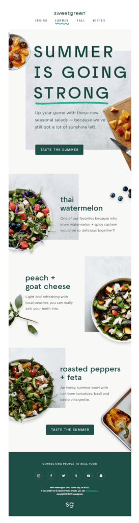
Food and Health brand SweetGreen uses green and nude colors in all marketing campaigns. In this example, they incorporate their signature color and fit them perfectly with the product images used. Like SweetGreen, your color scheme and images should suit each other as one seamless, cohesive design.
Your signature color scheme doesn’t necessarily have to dominate all your campaigns. Some emails, like holiday greeting emails, switch it up by combining it with seasonal colors. That can be achieved by playing with hues and intensities. Be creative, and don’t be afraid to be playful in using color in emails.
If you’re looking for color schemes for business email, however, there are several other factors you may want to consider. To properly understand what goes into a business email check out this incredible guide to business email.
Bottom Line
Plain and boring marketing emails are a thing of the past. As billions of emails are being sent out every day, your emails have to capture audiences swiftly and effectively. To do this, you have to gain that competitive advantage by employing an awesome design.
Stand out by using color in emails. A dash of color can brighten up your email and possibly boost its performance. Utilize its creative power by choosing a signature color scheme with bright colors to make your content stand out. These colors can be used as backgrounds or separators for each of your email’s segments. You can also use colors to highlight your email links and distinguish them from normal texts.
Don’t forget to style your images’ ALT texts with colors to make them just as pleasing when the images fail to display on the screen. Of course, your email content should not be overshadowed by all these colors and design elements. Keep your design clean and simple to make it easier for readers to read and appreciate your message. Good luck!
Bio
Owen Baker is a content marketer for Voila Norbert, an online email verification tool. He has spent most of the last decade working online for a range of marketing companies. When he’s not busy writing, you can find him in the kitchen mastering new dishes.