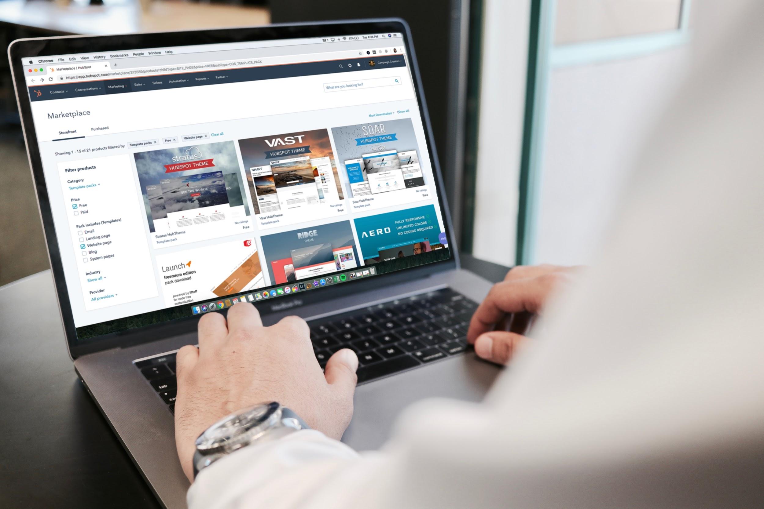
Due to the digitalization of the marketplace, most companies have been forced to shift towards an eCommerce business model. As a result, traditional physical shops have been replaced by product pages and online shops that allow consumers to purchase products and hire services over the internet.
However, due to the near-infinite possibilities that the internet provides prospective buyers, competition is more ferocious than ever. Subsequently, converting leads, keeping customers engaged, and closing deals have become priorities for brands with a digital presence.
Thankfully, some basic web design tips can help companies like you to develop product pages that convert leads. Whether you’re a big corporation looking to boost conversions or a small business owner learning on the job about how to launch an eCommerce webpage, here are some pieces of advice that work for any business.
1. Support your design with strong visuals
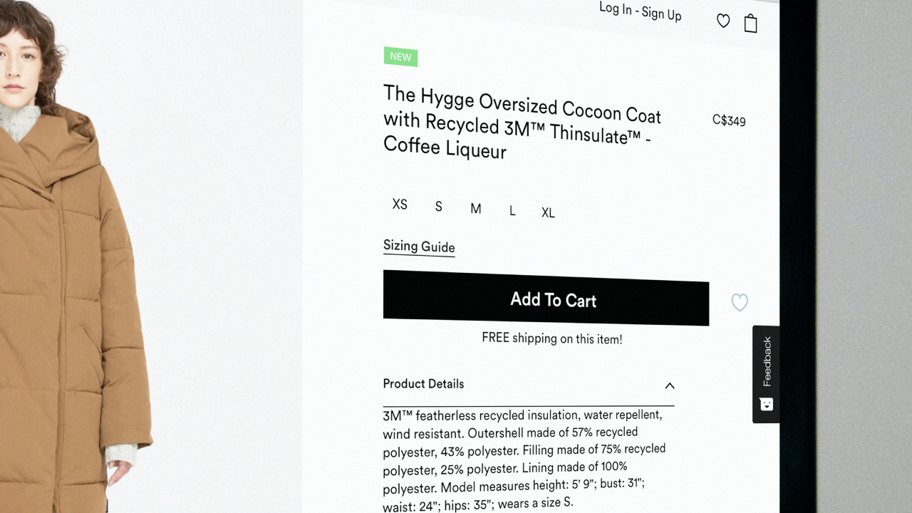
Designing an easy-to-navigate site is one of those obvious points that should be taken for granted. However, what many fail to understand is just how important the power of visuals can be when creating a product page. Giving informative product descriptions is essential, but an image is worth a thousand words.
According to experts like The 3M Company, visuals are processed 60,000 times faster than text. This means photos or images are not only more eye-catching but are easier to remember too. Using clear visuals is one of the most popular tips to create an engaging sales page for good reason.
Supporting your information with visuals is especially useful in cases where there are multiple options for the same item, like in the clothing industry, where you can find different colors, patterns, or sizes for the same product.
Additionally, there is an even stronger visual element: video. Videos are more engaging than still images and can convey a better image of what it is you’re selling. They can be used for any type of product or service, unlike photos which can only display physical items.
Videos can help you explain why your product is the best in an informative and entertaining manner.
2. Embrace customer reviews
Displaying customer reviews on your product pages can help you boost conversions since it allows prospective buyers to better understand what you’re trying to sell them. Additionally, giving leads the chance to read honest reviews makes your brand seem more transparent and trustworthy.
According to sources like Statista, the vast majority of online shoppers view customer reviews as a deciding factor in their purchases. Nearly a quarter of buyers think being able to read customer reviews creates a more realistic buying experience, and 26% prefer to read UGC (user-generated content) instead of copy written by a company.
You can leverage the power of social media to nurture your transparent brand image. Asking clients to fill in surveys or polls on social media platforms will not only allow you to know what your customers truly think, but it will also attract leads.
As we mentioned before, user-generated content is a very powerful publicity tool.
3. The importance of CTAs
Call-to-action buttons (commonly known as CTAs) are used to engage with leads and customers, asking them to take action. These actions are usually designed to close the deal and finalize the purchase.
It doesn’t matter how much interest a lead has in your product or service – if the CTA button is difficult to find or not persuasive enough, the prospective buyer will not close the deal.
A CTA button is made of four essential elements that can be used to create persuasive and engaging content that helps you convert leads. These are the keys to making the most out of your CTAs:
- Color. CTAs need to be eye-catching since most leads skim through content looking for the most important elements. An easy way to make your CTA buttons stand out is to use contrasting colors that highlight their importance, making them easy to see for online shoppers in a hurry.
- Size. It may seem like a no-brainer, but CTAs are often slightly bigger than the rest of the elements found on a product page since humans tend to use size-based visual hierarchy when processing content.
- Text. This element is a mix of two essential aspects: font and phrasing. Firstly, the font must be easy to read. But, even more importantly, the phrasing has to be persuasive and assertive. The most popular examples include things like “Add to basket”, “Sign up” or “Start now”.
- Positioning. CTAs must be easy to find. Your products page should be designed around the CTA buttons, guiding leads visually so they can find that “Add to cart” button as fast as possible.

4. Make accessibility a priority
Now we’ve covered obvious elements like visuals, CTAs, and transparency in the form of customer reviews, it’s time to talk about one of the most overlooked aspects of design, especially when developing a product page – accessibility.
Accessibility is key in the digital era. The digitalization of the marketplace has made a 24/7 schedule the new norm. It’s also important to understand that, nowadays, most leads multitask when purchasing products and services. For these reasons, implementing automated processes, like an interactive voice response solution, is vital. And with the power of automation, you can collect testimonials with Flowbox and place them where your customers are most likely to see them.
Business IVR technology is designed to automate the sales process, taking employees out of the equation and making everything easier and faster for the shopper and the company. Sometimes, prospective buyers are too busy to give a purchase their full attention, so letting them interact with their voice alone is a way of making things easier for them.
Furthermore, IVR can help you to make your services and products accessible to everybody. Visually impaired leads, for example, can interact with IVR solutions better than they would with a traditional products page.
It’s important to note, however, that we’re not talking about a total shift towards IVR. This is about giving options to leads, not narrowing down their choices to one approach.
5. The power of data
As with any internet-based or digital interaction, the power of data mining and metadata cannot be understated. As an eCommerce business owner, you can leverage big data to better understand your clients’ needs, pain points, preferences, and habits.
Gathering data can help you see what aspects of your product pages work and which don’t. Heatmaps are a very useful tool in this regard since they show you which CTAs your clients and leads interact with the most.
This insight can help you analyze visitor behavior to develop engaging and high-converting product pages.
6. Automate processes
Tracking your clients’ journey and implementing CRM tools can help you automate tedious processes like creating and filling in forms. Investing in high-quality form builder software allows you to reduce costs and boost productivity, making these operations faster and smoother.
Additionally, you can use sign-in services to gather your customers’ data and automate the purchase ordering process, making everything easier for your clients, business partners, and yourself.
7. Get a third party involved
Due to the digitalization of the marketplace, new professional profiles have been developed and the role of the website builder is now more relevant than ever. Sometimes, companies are simply not ready to launch their own eCommerce page.
There is no shame in lacking the skill or resources to face a daunting task like building a product page. Luckily, there are professional website builders you can turn to, who offer their services to make things easier for newcomers, taking care of the hard part for you.
8. Offer excellent customer service
Keeping leads engaged is essential to boost conversions, but sometimes the most important aspects of website design revolve around features outside of the site itself. Keeping your customers satisfied and engaged is one of those essential tips for high-converting eCommerce website designs.
Customer engagement techniques and features allow live engagement with leads, which usually translates into more conversions. According to Statista, 40% of customers in the US stopped doing business with companies due to poor customer service.
An easy way to avoid becoming part of that statistic is to invest in customer service software such as chat widgets, phone tracking, VoIP phones, and computer telephony integration, which allow your customer service and sales team to do their job efficiently and comfortably.
These are some of the advantages of VoIP:
- Increased accessibility. Thanks to their internet-based nature, VoIP phones allow leads and prospective clients to call from any part of the world and at any time.
- Excellent sound and voice quality.
- Support multitasking. This way, your sales team or customer service department can keep clients engaged while they attend to their queries.
- Easy to use and scalable. You might be wondering: “Do I need a special phone for VoIP?” The answer is ‘yes’, but do not despair – most VoIP providers include this within their services.
Additionally, VoIP phones can be used to connect your staff with prospective buyers. They can be a very useful collaborative tool within your company.
As mentioned before, some businesses have employees all over the world. For this reason, video conferencing and online calling software are a must. Any of the 7 best video chat apps to keep your team connected should do the trick.
Bio:
Richard Conn – RingCentral US
Richard Conn is the Senior Director, Search Marketing for RingCentral, a global leader in unified communications.
He is passionate about connecting businesses and customers and has experience working with Fortune 500 companies such as Google, Experian, Target, Nordstrom, Kayak, Hilton, and Kia. Richard has written for sites such as Cincopa and Multibriefs


