You can invest significant time in creating the most epic video that would benefit a broad audience, but unless someone clicks on it, your message won’t get across. When a video performs poorly, it may have nothing to do with your content or SEO strategy and everything to do with you not being able to grab your audience’s attention.
When someone performs a search on YouTube, they get a list of videos as a result. The only thing that will set your video apart from the rest is the thumbnail. This is where the important: “To click or not to click” decision happens, and if you haven’t created a click-worthy thumbnail, your audience will go to your competitor.
We’ve all heard the wise old saying, “Don’t judge a book by its cover.” However, in the digital world we live in, your videos will most certainly be judged by their thumbnails.
Why Thumbnail Design Matters
Your CTR (click-through rate) is one of the most critical metrics on YouTube. A CTR is the percentage of visitors who see your video on a specific page on YouTube and click on it.
Why is the click-through rate so important? For starters, a reasonable CTR means a fair number of viewers are watching your content. However, there is a hidden element that’s just as important, and it involves the ever-changing YouTube algorithm.
When your CTR increases, the YouTube algorithm considers you more popular and, therefore, more important. Next thing you know, your videos become more visible all over the platform – they get recommended to many people across different pages.
An excellent CTR is often the key to a channel’s success – and a great thumbnail is where it all starts.
There are many reasons why thumbnails are so important, but let’s mention the three main ones:
- They improve your click-through rates: The thumbnail has a massive impact on CTR. A custom, eye-catchy thumbnail will always have a better click-through rate than other generic video thumbnails on the search results pages.
- Higher CTR leads to better discoverability: YouTube has clearly stated that an increase in CTR can lead to more visibility, in their video analytics funnel.
“You can increase the chance of YouTube suggesting your content by increasing your click-through rate and your video watch time.”
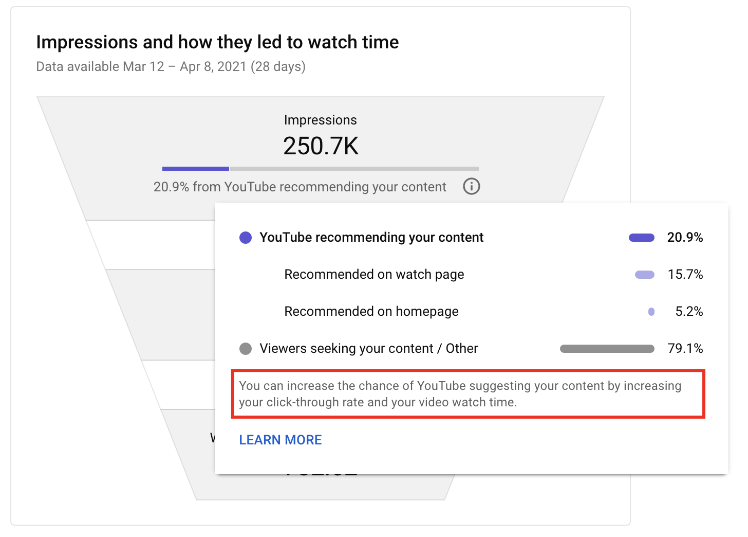
- They make your content stand out: YouTube is a visual platform where people come to feast their eyes on videos. Therefore, expect viewers to always look at the thumbnail before reading the title. Creating a thumbnail that stands out will make your video more attractive and prominent.
- They promote your brand: As an essential aspect of every video marketing strategy, branding should always be a high priority. With consistent thumbnail design, you can create a recognizable brand image for your viewers. You should even create YouTube banner online that is cohesive with your icon and thumbnails in order to have consistent channel art that viewers recognize.
The thumbnail helps the viewer decide if your video will be worthwhile. Creating a custom image instead of using a generic screenshot offered by YouTube can make a world of difference for your CTR.
Let’s check out what makes a thumbnail attractive and engaging.
What Makes a Thumbnail Engaging and Click Worthy?
Well-designed thumbnails will attract more viewers to your channel. They will also encourage them to watch a video until it ends because they’ll know what to expect.
Several key factors make a thumbnail engaging, and they include the following:
- Colors: Use vibrant colors to make your thumbnails stand out. Moreover, make sure to use distinctive brand colors to raise brand awareness.
- Headline: Use large fonts to include a headline in the thumbnail to grab the viewer’s attention and give the thumbnail more context if needed.
- Faces: Thumbnails with faces are way more successful than those without them.
- Intrigue and storytelling: The thumbnail should show an intriguing fragment of a story and represent a short, teasing intro into your video. Intrigue is a powerful tool for boosting CTR.
- Logos: Using logos in thumbnails is vital for brand awareness.
- Consistency: Thumbnails allow you to create a distinctive style for your content. That way, your viewers recognize your videos and connect them to your brand whenever they see one of your thumbnails.
Including these elements in your thumbnail design can make or break the success of your video. Now, let’s go into more detail on creating the ideal thumbnail image.
How to Design a Thumbnail That Gets Clicks: 9 Useful Tips
Designing a click-worthy thumbnail requires some focus and careful planning. We’ve prepared nine useful tips to help you get started.
Use a Relevant Image
Using a relevant image as a thumbnail is essential, whether you’re into explainer video production or filming a personal vlog. YouTube users are very visual so always keep that in mind when choosing the imagery for your thumbnail.
Make sure to get your point across as quickly as possible with the image. Close-up shots often work best in thumbnail format, and they make your content more recognizable.
Don’t make your viewers wonder what the video is about – let the thumbnail give them a clear idea of the content. Always remember to replace an image that does not seem to perform well. A misleading thumbnail image will break your viewer’s trust.
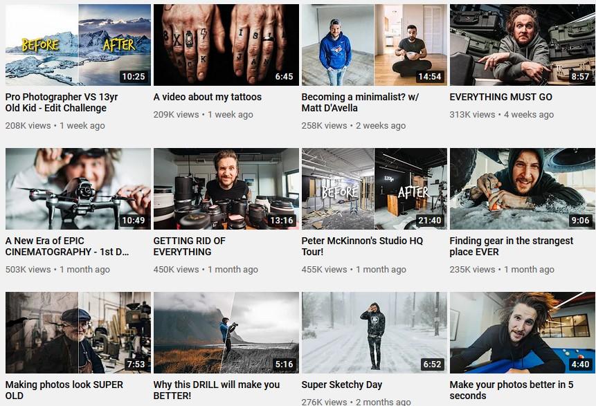
YouTuber Peter McKinnon is an excellent example of great imagery usage for thumbnails.
The First 15 Seconds’ Rule
Have you heard about the 15 seconds rule when it comes to grabbing someone’s attention online?
If you’re using a snapshot of the actual video in the thumbnail, make sure you take it from the first fifteen seconds, especially if it’s a super-interesting snapshot. Otherwise, your viewers may feel tricked and consider your thumbnail a clickbait.
For example, let’s say you’re filming a travel video from your last visit to Barcelona, and you include a fabulous snapshot in the thumbnail. To satisfy your viewers, make sure they can see that snapshot within 15 seconds of clicking on it.
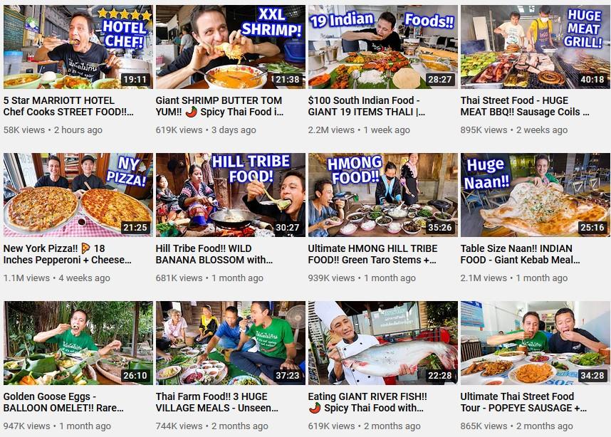
In the following example, YouTuber Mark Weins includes photos of delicious dishes in his thumbnails, and you can see the displayed dishes as soon as the video starts.
Use Vibrant Colors
Bright, vibrant colors drive attention. The layout of the YouTube platform mainly consists of two primary colors: white and gray. A plan background allows you to play with colors and make your thumbnail stand out.
The brighter the colors, the more eye-catchy your thumbnail will be. Many successful YouTubers use a pop of color in their thumbnails, whether it’s a colored text or a color block.
Moreover, make sure to incorporate your brand colors as well to create a recognizable visual.
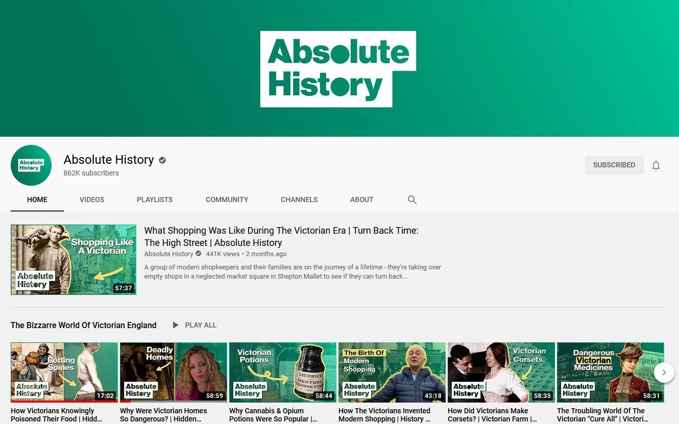
An excellent example of incorporating a vibrant brand color into their thumbnails is the popular YouTube channel Absolute History.
Adhere to YouTube Size Requirements
Every social media platform has different image size specs and guidelines you should follow. The same goes for YouTube thumbnail images. YouTube has specific image size requirements as follows:
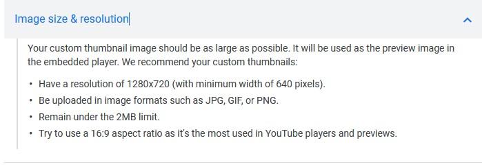
Adhering to YouTube image guidelines will give your thumbnail an advantage over the competition in the eyes of the platform’s algorithm. Pay extra attention to the aspect ratio.
Add Text For Context
Adding text to your thumbnail design is a great way to get your viewer’s attention. Although it’s not always necessary, it’s often good to include the title of your video or some relevant keywords to give your viewers more context.
When you include relevant text, you make sure the viewer knows what the video is about before seeing the YouTube title. Make certain the text is precise and thoughtfully designed so it doesn’t overshadow the image. It should act like a hook to get your viewers enticed to watch the video.
For example, YouTuber SarahBethYoga adds short, on-point text to give clear context to her thumbnails:
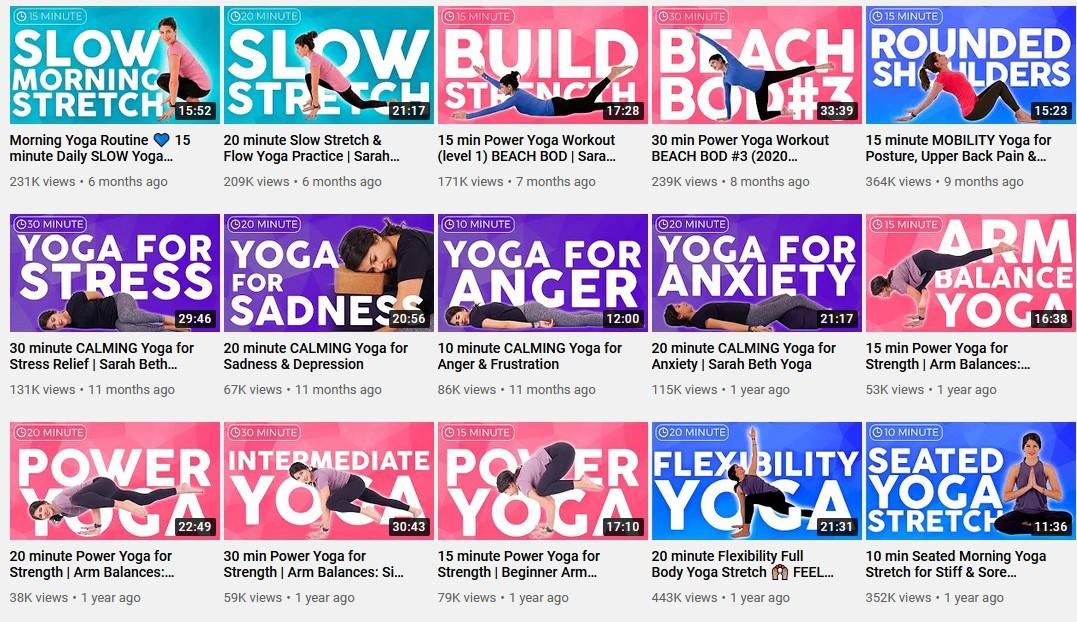
Author’s note: Google can read the text in your YouTube video thumbnails, which can further help with your video’s discoverability on Google’s search engine. So make sure to leverage your target keywords and their variations in your thumbnail image whenever possible.
Choose the Right Font
Now that you’ve picked your text, it’s time to choose a font. While it might be tempting to use fancy fonts, sticking to nice, clean letters is the best way to go. Beware of epic-looking screen fonts and outlines, as they are very hard to read at a glance.
The main goal of the thumbnail is to communicate quickly, so using funky fonts is hardly a good idea.
If you already have determined business visual branding that includes a specific font, include it in your thumbnails to make them recognizable.
Show a Person in the Thumbnail
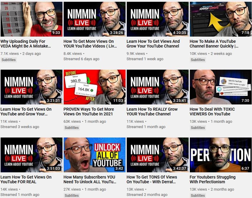
Shots of people’s faces always work well as thumbnail photos. The human brain loves seeing faces. According to research conducted by the Radiological Society of North America, including a photo spurs empathy and an eye for detail. Moreover, scientists recently discovered an eye-contact detector in the brain that activates even faster if the whites of the eyes are visible.
A picture of a person that looks into the viewer’s eyes works even better in getting more views on YouTube.
Popular channels always put faces on their thumbnails. Nick Nimmin is an excellent example.
Be Consistent
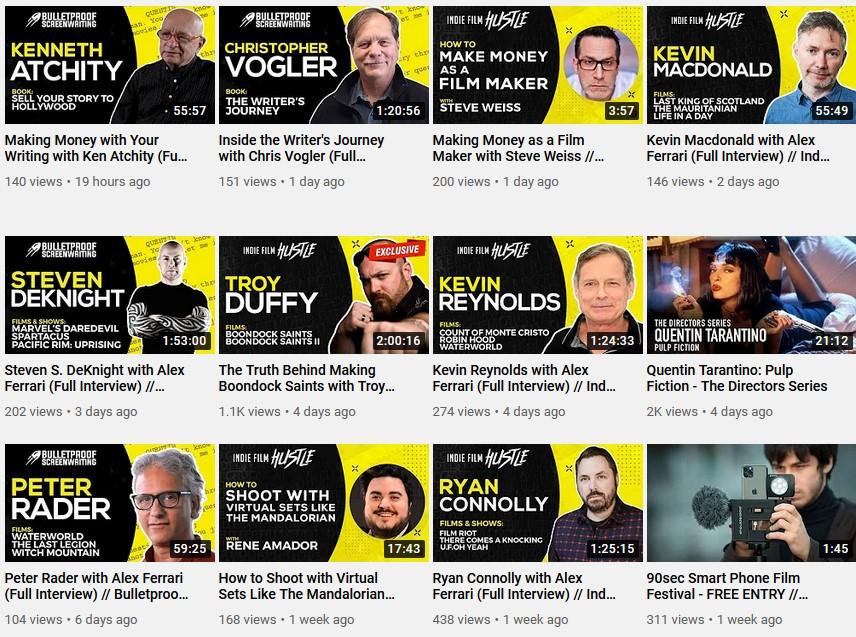
When you’re consistent with your thumbnail design and all of your thumbnails follow the same consistent look, viewers will recognize your content at first glance across YouTube and social media. You may choose your consistency, whether it’s a distinctive font, a color, a design element or shape, layout, or the face or a particular person.
Whatever you choose, make sure all of your thumbnails follow the same style. Consistency is potent because it builds your brand image and subconsciously teaches people to look for that familiar element among many videos in search results.
The Indie Film Hustle channel, for example, has chosen to be consistent with thumbnail design as following:
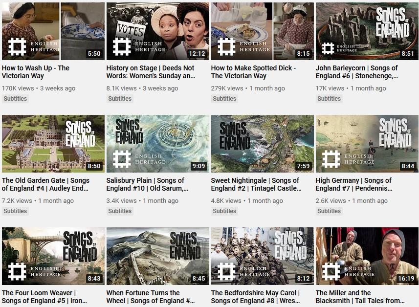
Include Your Logo
Your logo is an essential part of your brand, and you should include it everywhere, including your thumbnails. This way, viewers will always recognize the content is yours, even when they see it embedded outside of the platform.
Put your logo wherever you can and let the audience know who you are. A great example is the YouTube channel English Heritage.
Best YouTube Thumbnail Design Tools
Designing an eye-catchy YouTube thumbnail is easy with the right tools. They allow you to get creative quickly and easily. The most popular ones include:
- Visme: Although sometimes referred to as a Canva alternative, Visme is a complete thumbnail maker with many professionally designed templates and personalization options. It allows you to customize photos, colors, graphics, and fonts to match your video content.
- Canva: As one of the most popular tools among designers, Canva offers many valuable features. With simple drag and drop functionalities, it allows you to create a professional thumbnail even if you have no prior experience.
- Photoshop: Although it requires some research and learning, Photoshop is an incredible tool. You will need to do everything by hand, but it also means you can customize the thumbnail however you want. If you’ve never used it, start by watching a tutorial on making a thumbnail with Photoshop.
- TubeBuddy: TubeBuddy is a browser extension that integrates into your YouTube channel and provides you with tools like analytics, keywords, social sharing, and thumbnail creation. It uses stills from your video and allows you to generate your templates.
Closure
There is an ocean of content on YouTube, and the competition is fierce. For your content to stand out, you must create custom, eye-catchy thumbnails for each video. With valuable tips in mind and several handy tools to explore, you should be on your way to creating smashing thumbnails in no time.
 |
Author: Amir Shahzeidi
Bio: Amir is the SEO Lead at Uscreen, an all-in-one video monetization and OTT platform provider that empowers video entrepreneurs and creators to monetize their content and build thriving businesses around their videos. |


