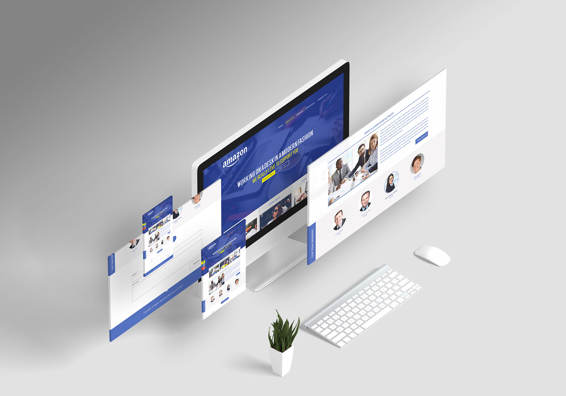
When it comes to online lead conversion, landing pages are one of the key elements of website design. In essence, a landing page is the first real contact a potential customer has with your site. In order to generate conversions, all ecommerce sites need a dedicated landing page with a contact form.
In the case of most subscription-based services, as well as online shopping platforms, many companies use landing page forms to capture their leads’ contact information. In general, filling in these forms is the last step in the lead conversion process. For that reason, having a well-designed landing page form is integral to gaining more conversions and closing deals.
If you are unhappy with your current landing page form’s conversion results, we have a few handy tips for you. Perhaps you’re an inexperienced digital entrepreneur with no web design experience at all. If you’re trying to create your own small business website do not despair, here are some pointers for designing the perfect landing page form, boosting conversions, and seeing your sales rates rise.
Employ a User-Friendly Design
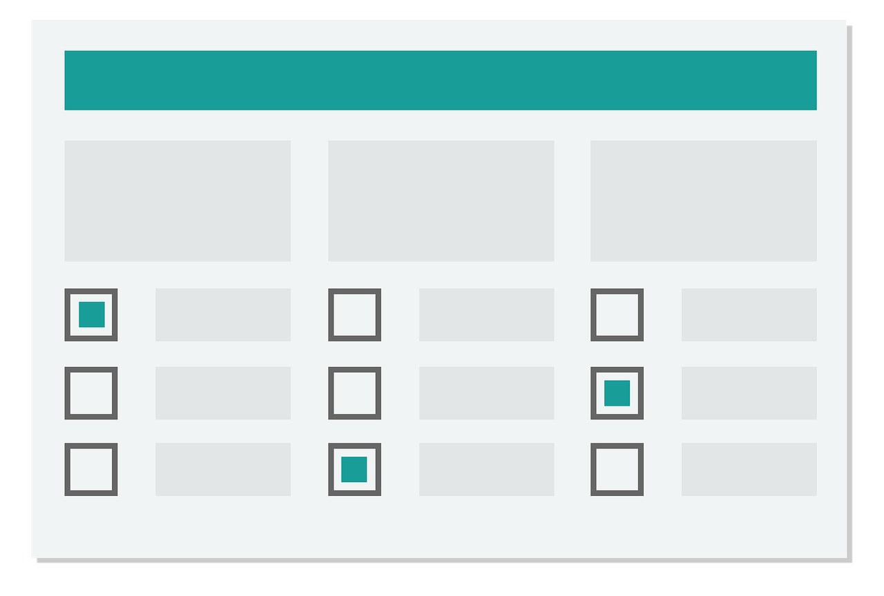
Having an easy-to-navigate design is essential in order to help leads fill in the forms faster. An efficient design is key in order to close more deals. That said, let’s break down what makes a form design user friendly:
- Using visual cues to guide the readers’ eye. In terms of design, a form shaped like a column tends to be easier to follow. Since humans read from top to bottom, your users will instinctively understand what steps to follow if you design your form following this simple logic.
- Use help or infoboxes to address potential issues. If you are asking for any specific details that may confuse your leads, make sure to include all key information to help them understand exactly what you want from them.
- Use sliders and click buttons to minimize unnecessary typing. Internet users are used to fast interactions and they’re not always very patient when it comes to doing kind of tedious chores like filling in contact forms that is why they use sliders and click buttons to minimize typing.
- Use eye-catching CTAs. In order to start the form-filling process, many landing pages use CTA (Call To Action) buttons. The best CTAs are those that grab the visitors’ attention due to key characteristics:
- Size: they have to be big enough so that they are easy to spot.
- Color: giving them contrasting colors can help you highlight them on a busy landing page.
- Language: CTAs tend to use assertive and engaging language. Some common examples include wordings like: “Sign me up!” or “Get me started NOW”.
Optimize for Mobile
According to Statista, over half of Internet users (55.4%) who purchased items and services online did it via mobile devices during 2020. This trend is particularly popular in countries such as Indonesia, Thailand, the Philippines, Malaysia, Saudi Arabia, and China, where an average of 70.1% of the population bought something online using their phone.
In Western countries like the United States, Mexico, Brazil, and the United Kingdom, the average of online shoppers using mobile devices to purchase items is slightly lower. However, in the aforementioned countries, only around half of the population bought things on the Internet using their cell phones during the past year.
As you can see, this growing trend is reshaping how leads interact with digital business. For that reason, it is essential not to neglect mobile users when you design your landing page forms. The best way to do this is by using a responsive design. Remember, designing your site’s pages and forms with mobile users in mind is one of those top ecommerce marketing tips to grow online store sales that never fail.

Cybersecurity and Form Design
Whether you are running a subscription-based service or your company’s services require some form of login, you want to ensure maximum security for your clients and your own business.
First of all, you will need to use identity validation to prevent server attacks and malicious code corrupting your site’s code. The best way to avoid cyberattacks is by requesting strong passwords or giving users a predetermined password.
Additionally, you can set traps for hackers using brute force attacks to breach your password security. The best thing about these traps is that you can do it all hidden far from users’ sight. If you are concerned about cyberattacks, remember to use hidden fields that spambots will fill but users won’t. This way, you can preemptively prevent any cyber breaches.
If that approach seems overly complicated for you, then you can resort to CAPTCHAs. However, keep in mind that many internet users and ecommerce customers tend to find these particularly annoying. According to industry experts Forbes, overusing CAPTCHAs could end up negatively influencing sales.
Implement Automation
Automated forms, commonly known as smart forms, can help you make more efficient forms with a higher conversion rate. Embracing RPA (Robotic Process Automation) is an excellent way of speeding up the form-filling process in order to help users with tasks like writing their name or age.
Thanks to smart technology, completing forms has never been faster and easier. Autofill forms can use the leads’ information retrieved from past interactions and automatically fill fields like name or address. One simple way of gathering your potential clients’ and current customers’ data is cold calling.
Many call centers use business VoIP phone service solutions technology that includes very useful features such as IVR (Interactive Voice Response) systems, call recording, and call logs. The latter can help you save important information regarding your leads and clients.
Although IVR technologies have been upgraded and improved in recent years, sometimes leads can have difficulty interacting with an automated communication service. These issues can be particularly challenging in scenarios where there are language barriers, or the customers do not have the best hearing, either due to their advanced age or any type of disability.
The best way to combat those potential adversities is using the NATO phonetic alphabet. When exchanging important information between IVR systems and customers, using the phonetic alphabet increases clarity.
When it comes to call logs, you can always use these call register technologies to schedule automated delivery of pre-recorded data from recent calls, dumping all the essential information into pre-filled forms. However, more complex, or sensitive issues like gender identity, sexual orientation, or ethnicity should be left for the customers to fill on their own terms.
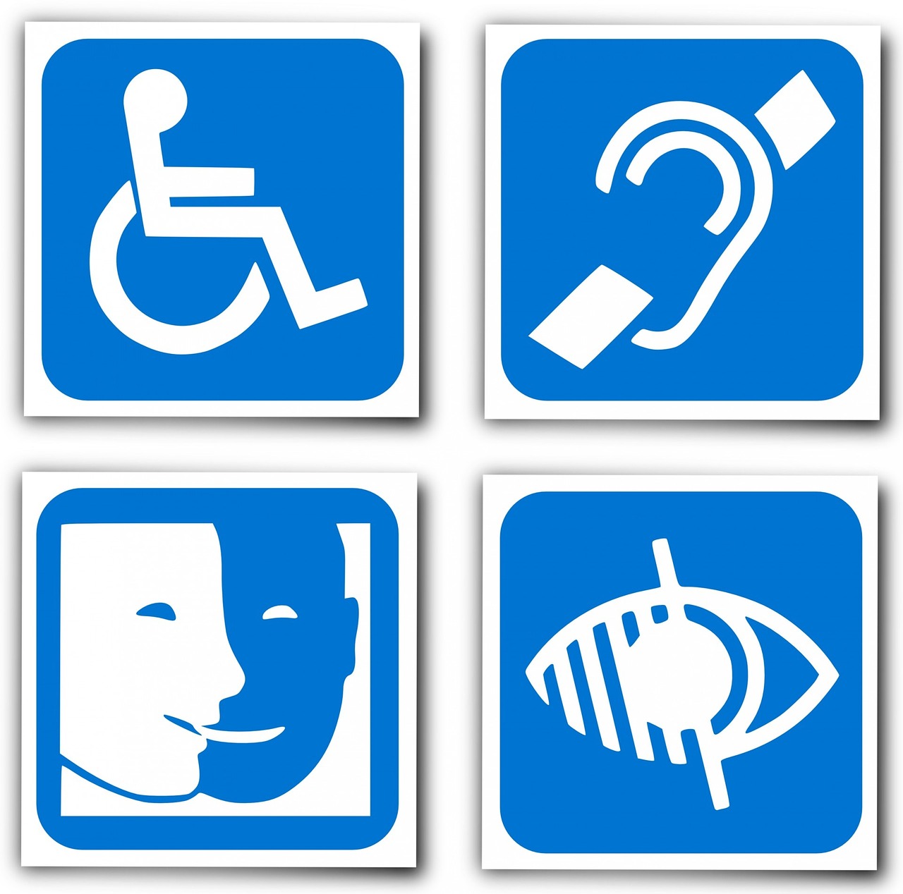
Design for Everybody
As previously mentioned, in order to have a high-converting design, it is essential to build a user-friendly landing page form. Although the tips we shared at the beginning can help you design a generic form that is suitable for all types of leads, it is important to have your potential clients’ needs and preferences in mind.
The best way to ensure that you are committed to crafting an easy-to-navigate page is by adding A/B testing to your design process. A/B testing, also known as split testing, is a process that allows designers and digital companies to compare which variant of their digital marketing could potentially drive more conversions.
If you allow your test users to provide you with feedback regarding how good your landing page form is, you will increase your chances of creating the perfect form.
Although all of these tips should be enough to create a bulletproof landing page form design, sometimes issues can arise regardless of how much effort you put in. Most average landing page forms tend to create accessibility problems. Visually impaired leads, for example, are often neglected by companies, since their designs do not include an audio-based description of the forms the clients are trying to fill.
Neglecting to be inclusive can not only affect your conversion rates but may also result in negative reviews and formal complaints that could be detrimental to your brand’s image. The best way to combat these accessibility challenges is by offering live customer support when needed.
The best landing page form designs are those that include a help button that can connect leads with sales representatives or customer service experts ready to offer assistance during the form-filling process. In the case of visually impaired users, for example, they may have to resort to audio-based support. Conference calling software solutions are ideal in this regard since they can be used by all users regardless of their needs.
The Takeaway
Now that we’ve gone over the key details that will help you design the perfect landing page form, let’s cap things off with a short reminder of every point in this article:
- Prioritize creating a user-friendly design.
- Optimize for mobile.
- Do not neglect the importance of cybersecurity during the design process.
- Use automation and smart forms when possible.
- Remember the importance of accessibility and inclusiveness.
- Offer live customer support when needed.
By following these simple yet essential steps, your site will have a pitch-perfect landing page form that not only looks the part but also offers universal accessibility.
Bio:
Marjorie Hajim
Marjorie Hajim is the SEO Manager for EMEA at RingCentral, a Global VoIP provider offering call centre software and video calling online. She develops and executes strategies for short-term and long-term SEO growth. In her spare time, she loves reading books at coffee shops and playing with her dogs.