Having a poorly accessible website is one of the quickest ways to create barriers to entry that can keep leads from converting into customers.
But improving navigation and visual accessibility isn’t just a wise marketing move, it’s the right thing to do. Making sure your website is accessible to everyone means you truly value promoting equity, diversity, and inclusion for all — something many companies are still struggling with.
In fact, the Harvard Business Review says they’d describe even the most progressive organizations as “divers-ish” painting the picture that disabilities are still neglected in diversity and inclusion (D&I) efforts.
In other words, if you’re ready to do what it takes to make your site accessible, you’re one step ahead of countless competitors.
Let’s take a closer look at the importance of website navigation and visual accessibility, along with eight simple steps to help you improve yours.
Ready to learn more?
Let’s begin.
Why it’s crucial to improve navigation and visual accessibility
Taking website navigation and visual accessibility seriously is pivotal to creating an online space anyone can interact with.
Here are some of the top reasons why improving navigation and visual accessibility is important:
- Supports users with visual, auditory, physical, speech, cognitive, and neurological disabilities to access and interact with your site
- Allows users to get the information they need quickly and easily
- Supports the buyer’s journey with quick and accessible checkouts
- Promotes a better customer experience with accessible contact forms
- Promotes a clear understanding of what your business offers and the problems you solve
And an extra bonus? Designing your website with accessibility in mind doesn’t just benefit users — it also bodes well for your bottom line. Improving the user experience and making your site inclusive encourages lower bounce rates and more purchases so you can accelerate your revenue. Win-win.
8 simple steps to improve navigation and visual accessibility
Now that we’ve laid the groundwork, let’s take a look at how to improve the navigation and visual accessibility of your website in eight simple steps.
1. Add internal links to relevant content
Help users navigate to helpful, related web pages by adding internal links to relevant content.
For instance, if a user is perusing your About page, adding a link to your Services page can help them head over to learn how to work with you quicker.
Or, if a user is reading one of your blog posts, adding internal links to other articles and helpful resources can help users stay on your site longer — versus heading to a competitor to get the information they need.
Take a look at the following PODS comparison article for reference:
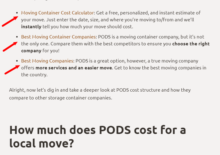
In this example, we can see plenty of internal links to relevant resources — keeping users engaged and motivated to stay on the website longer.
2. Optimize your site for mobile and keyboards
With the share of mobile users increasing by over 10% compared to desktop users, making sure your site is optimized for mobile is a must.
When optimizing for mobile, make sure:
- All tabs and links are easily visible
- Navigation between tabs and links is pristine
- Everything on your site loads quickly and correctly (no odd formatting issues, please)
- Nothing is overly touch-sensitive
- Nothing is stuck or unclickable
It’s also important to make sure your webpage is keyboard-friendly. Since some people with disabilities can’t use a mouse, you need to make sure they can access all of the elements inside of the web page using just a keyboard.
3. Choose your fonts and colors wisely
Color theory is fundamental to visual navigation. Choosing the right colors that create contrast and are visually appealing can drive visitors’ attention and increase the average time they spend on your site.
Take Stack’s website, for example:
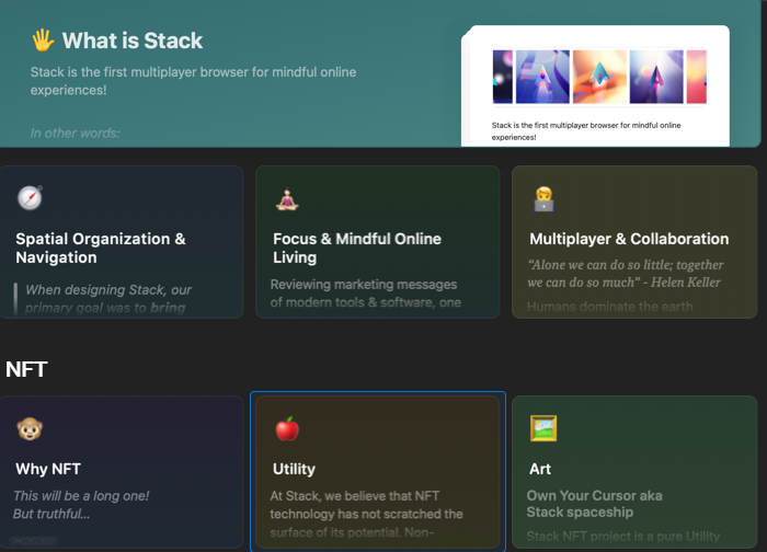
The site shares details about Stack’s NFT by dividing information into colored categories, making it easier for users to read and interpret.
For people with visual impairments, it’s important to be extra careful with fonts and color usage when designing your website. Consider using a font generator to come up with a unique and on-brand font for your website — but make sure to consider users who may not see well when finalizing your pick.
When selecting your colors, don’t rush.
Here are some quick tips to help you choose the right colors for your site:
- Make sure the colors and contrast you choose help to differentiate the elements on your web page
- Stay away from red-green color palettes to support users with red-green color deficiencies
- Use a text color that separates from the background color
- Stay away from super bright, flashy, and/or sparkly color palettes
- Never sacrifice functionality and ease of use for the sake of a pretty design
4. Befriend negative space
When creating a site that’s accessible for all, negative space is your friend.
With a healthy dose of negative space, users can distinguish between text and images so they can digest information quicker.
In other words, make sure to have a good balance of images and text on your site.
Break up large sections of text with photos and vector graphics. Summarize lengthy content with easy-to-read infographics. Write copy that’s free of fluff and unnecessary jargon with an AI text generator. And break up your articles and text-dense pages into subsections using H1, H2, and H3 subheaders.
5. Add directory links/Mega Footer
Add directory links — aka a “Mega Footer” — at the bottom of your site to give users complete access to everything your site has to offer. Think of it as a table of contents, if you will.
A Mega Footer is an effective way to improve your site’s bounce and conversion rate since users can click and head directly to the sections they want with ease.
Take a look at this Mega Footer on American Trucks’ website, for example:
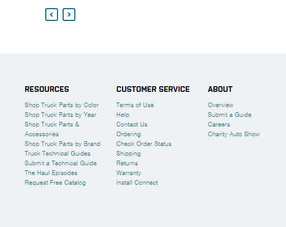
In this example, users can access the Mega Footer to quickly shop for truck parts or to learn more about the company and its customer support options.
With a directory like this, users feel supported and guided. They have access to the information they need to make an educated decision about working with you.
6. Include the most important information at the top of the page
While it might sound obvious, users typically look at the top of a web page before scrolling down to inspect the rest of a site.
To take advantage of this natural approach to website navigation, make sure to include your business’s most important information at the top of the page.
For instance, that might include:
- Your ecommerce store tab
- Your shopping cart and check-out tab
- Your About page tab
- Your Contact page tab
- Your Portfolio page tab
- Your Services and offers page tab
- Links to follow you on social media
- Answers to frequently asked questions
- Highlighted promotions and countdown timers
- Link to book a session, call, or meeting with you
7. Add alt-text to images
Add alt-text to every image you’ve included on your website.
Alt-text is a feature that helps convey the “why” of an image as it relates to your website or blog.
Users with screen reader software take advantage of this feature to understand what an image portrays — an especially helpful feature for users with visual disabilities.
Search engines also index alt-text, so it’s a great opportunity to earn some SEO points, too.
8. Make your contact form accessible
Make sure your contact form is easy to access by keeping a close eye on your form field labels.
For instance, if your form requires a user’s first and last name, be sure the field label reads “First and Last Name” and not just “Name” which would confuse users.
It’s also important to use a simple, clean font that’s large enough to read. Finally, make sure users can easily navigate between fields using the tab button.
Wrap up
To create an inviting and engaging site, it’s crucial to prioritize removing as many barriers to entry as possible.
Not only can a poorly accessible site keep leads from converting, but it also alienates users with disabilities — a group of over one billion people.
Bottom line? When you improve your site’s navigation and visual accessibility, you open the door to opportunity. And who benefits? Both your business and your prospects.
To give you a leg up, here’s a quick recap of the steps we shared today:
- Add internal links to relevant content
- Optimize your site for mobile and keyboards
- Choose your fonts and colors wisely
- Befriend negative space
- Add directory links/mega footers
- Include the most important information at the top of the page
- Add alt-text to images
- Make your contact form accessible
And that’s it for now!
Are you ready to improve your website’s navigation and visual accessibility? Then you’ll love our clean and accessible templates. Try them out for free, today.