
Infographics are among the most popular and efficient types of graphics that are used virtually to get messages across. In Fact, 200 marketers revealed that graphics had the strongest impact on their marketing efforts.
In this post, we’re going to show you eight unique infographic examples that can inspire you.
We’re also going to take you through some tips for compelling and engaging infographic design. Also, how companies should have a best hiring strategy for such roles and experts.
Without further ado, let’s get right into it.
Table of Contents
What is an Infographic?
Eight Examples of Infographics to Inspire You
Seven Tips for Beautiful Infographic Design for 2021
What is an Infographic?
First things first, let’s start by defining what an infographic is.
An infographic is basically an engaging and comprehensive way of presenting any kind of information in a visual way.
In other words, it’s a visual representation of data and information.
But, before we get any deeper into the topic, let’s have a look at an infographic and make its definition a bit more clear.
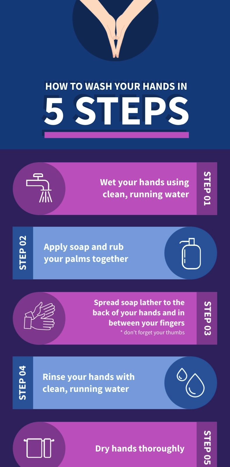
As you can see, this infographic is a visual representation of a specific process.
Put another way, this graphic describes the steps of efficient hand washing.
There are many different types of infographics including video infographics and they can all be used to convey information in an eye-catching and easy to get way.
Depending on the type of information or data you want to present, you can create an infographic of a different type.
For example, you might want to create a timeline infographic or a comparison infographic.
In all cases, you should keep in mind that you’re basically presenting visual content.
For that reason, you shouldn’t forget the visual aspect of the graphic; the color scheme, the font you’ll be using, the size of the different visual elements you might be using to enhance your infographic, and so on and so forth.
To cut a long story short, a good infographic is one that’s visually appealing, it catches the viewer’s eye, and manages to successfully transmit the information it presents.
Keep reading to find out more about infographics through eight great examples that can totally inspire you.
Eight Examples of Infographics to Inspire You
In this part of our post we’re taking you through eight fantastic infographics examples that you can use for inspiration when creating your own graphics.
Let’s get started with our first example.
Example #1: Airfocus
The very first example we’d like to share with you, comes, like most of the infographics in this list, from a blog post.
The fact that writers and content creators are using infographics within their posts proves to us that these types of graphics can make text far more engaging and keep the blog visitor interested in the content.
Have a look:
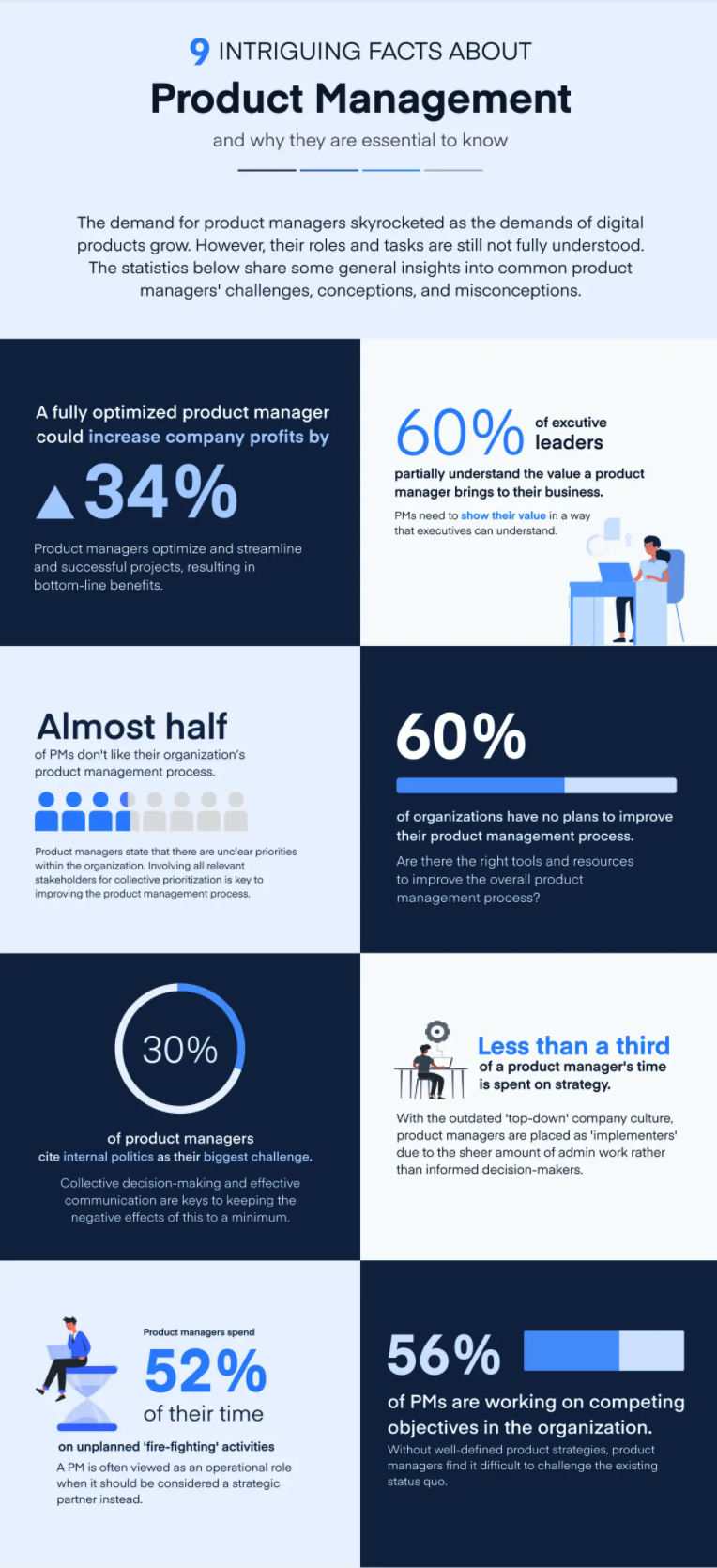
Image Source: Airfocus
Airfocus, which is a modern product management tool, published a post about product management stats.
The stats are presented in an infographic form that’s easy to read and engage with.
We understand that, if they were to publish a blog post that presented the stats in a textual instead of a visual form, the result would of course be less engaging.
As you’ll probably understand as you go down our list, infographics are used to communicate complex information or data in a more casual and playful manner that prevents the reader from being overwhelmed.
Moving on to the next one.
Example #2: RingCentral
Yet another example of an infographic used in a blog post to enhance the post’s content is the following:

Image Source: RingCentral
The reason we’ve chosen to show you this one is because it is quite different to the others presented in this list.
This particular infographic from RingCentral focuses almost entirely on the visual aspect of the graphic.
On the other hand, it only uses text as a way to enhance the flow of the story told by the visuals.
We therefore understand that there’s a wide variety of choices when it comes to infographic design and the way one chooses to tell their story.
Let’s get to our third infographic.
Example #3: Socialpilot
The third infographic example we have for you comes from Socialpilot.
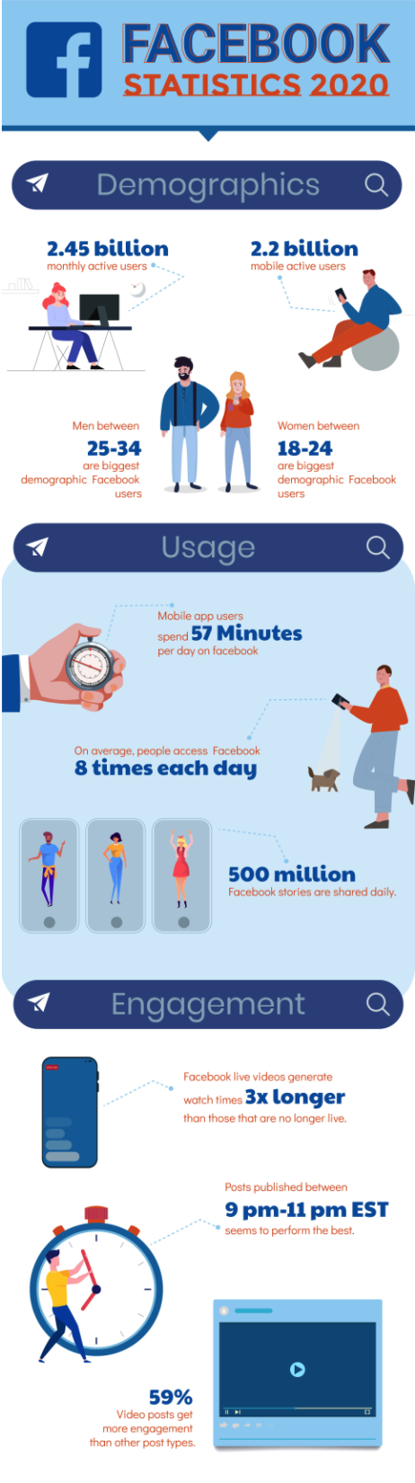
Image Source: Socialpilot
As you can see, it’s an infographic that presents that viewer with Facebook statistics for 2020.
What you may have noticed already is that it contains a lot of information and data.
However, it doesn’t make the viewer feel overwhelmed by the quantity and type of information.
On the contrary, it’s a playful graphic that invites the viewer to take a closer look at it and get some insights in relation to Facebook demographics, usage, engagement, as well as the rest of the categories which are not shown in the snapshot above.
Moving on to our next example.
Example #4: Referral Candy
Another infographic example I think might inspire you is this one:
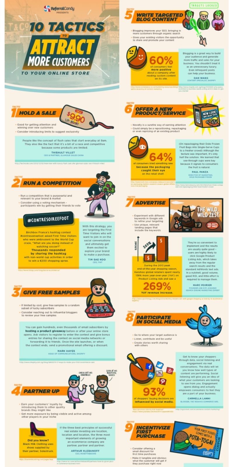
Image Source: Referral Candy
ReferralCandy frequently uses infographics in their blog posts.
The use of infographics here is justified by the fact that infographics are an interesting and compelling way to raise awareness on your products and services that’s direct and will make the viewer want to engage with your content.
This graphic includes both visual elements as well as text that provides the viewer with additional information on each of the ways presented in the infographic.
Let’s now move on to the next example.
Example #5: Moosend
Our fifth inspiring infographic example comes from marketing automation platform, Moosend.
This infographic from Moosend is one that successfully design and manages to present information in relation to cart abandonment rate and reasons.
Given the quantity of information included in the infographic, we understand that an alternative — non-visual way of presenting the same amount of information — would probably be too overwhelming for the viewer.
Have a look:
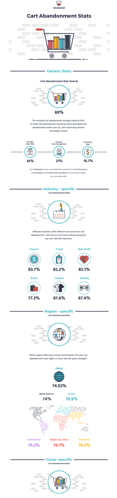
Image Source: Moosend
However, the infographic is very successful in terms of getting the message across.
We’re getting towards the end of our inspiring infographic examples list, so keep reading to find what the next example is.
Example #6: Uscreen
The live streaming stats infographic by Uscreen that follows, gives us insightful information on a number of live stream statistics for 2020.
As you’ll see, in terms of presenting the stats, the designer has used different visually engaging ways.
What’s also important to mention is the use of colors and the stylistic consistency of it.
Here it is:
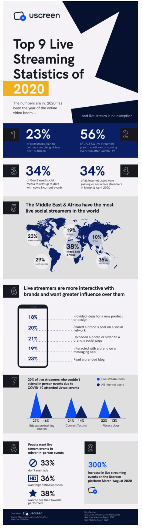
Image Source: Uscreen
What we particularly love about infographics like this one is that it manages to get one’s attention in no time and makes you want to know more about the topic.
Put another way, after having seen an infographic like this, you might feel that you’ve already learnt quite a lot in a relaxed and easy way.
This makes you more willing to want to dive deeper into the topic.
In fact, that’s one of the main points why you should be using interesting graphics more.
That is, to create a casual relationship of sharing information, data, and any other kind of content with our audience.
Put another way, think of infographics like a type of content that can work as a communication platform for your audience without making them feel like they should put tons of effort and time in understanding your points.
Find our next example below.
Example #7: PRG
Our second to last example comes from a blog post on the most searched promotional products in Canada.
This infographic is quite different from others in this post because it mainly focuses on text.
In other words, text has been put together into a graphic to make the result more engaging for the blog visitor.
Other than that, a limited number of colors has been used to enhance the visual aspect of the graphic and make it consistent from beginning to end.
More on this later on in this post.
For now, have a look at the infographic we’ve been talking about:
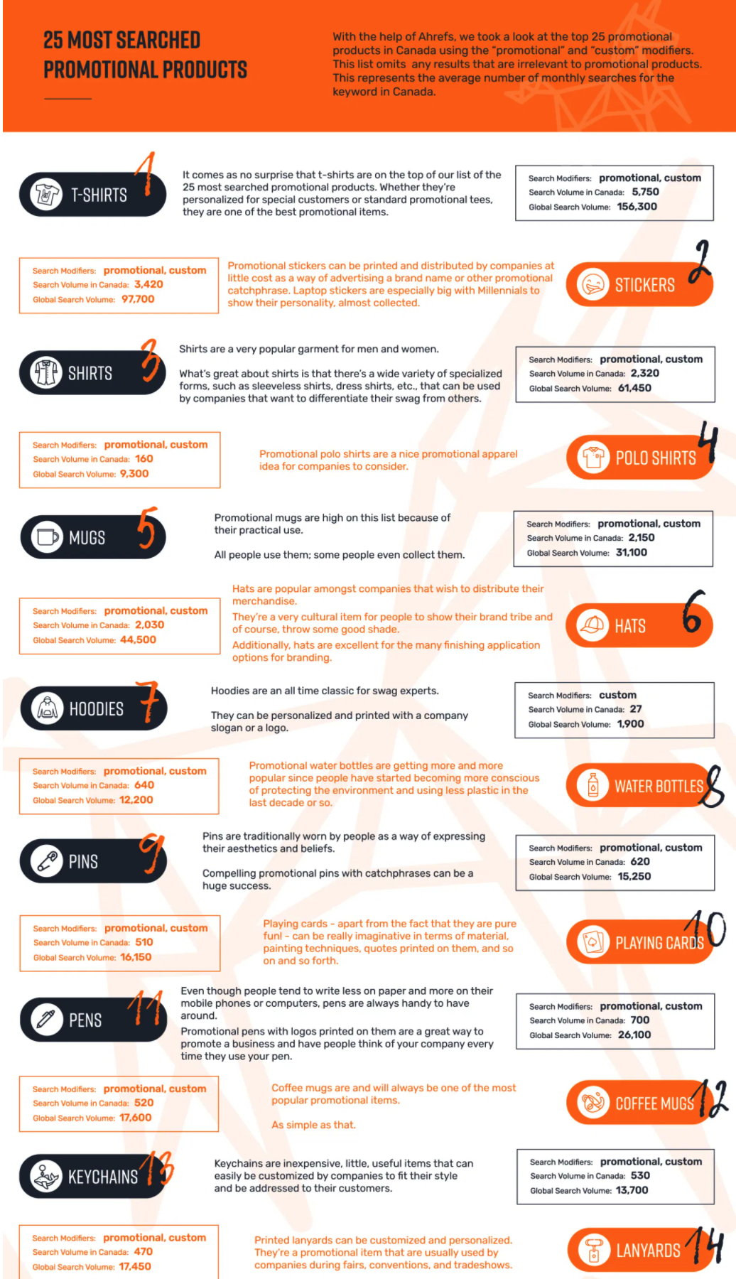
Image Source: PRG
Given that infographics are a very efficient way of visual communication, it makes sense that instead of publishing a post that presents twenty five different products, they publish a graphic that includes it all in a shorter and more engaging way.
Hypothetically speaking, a post that would be mere text would probably be too long and even too boring.
We’ve now made it to our final example.
Example #8: MINUTTIA
The last example of an infographic you might want to use as inspiration comes from a post on blog post templates by content and SEO agency, MINUTTIA.
Once more, this is a different type of infographic that doesn’t focus on including graphics and images.
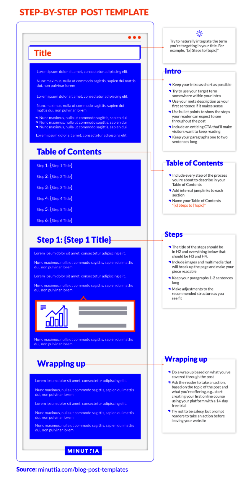
Image Source: MINUTTIA
However, it could be considered a process infographic that describes the steps of a process in the form of a template.
This is yet another use of an infographic that you could consider using depending on the type of information you’d like to include in it.
After we’ve seen these eight different examples of infographics and infographic templates, which are only a small part of the great visual content that’s out there, we can move on to the next part of our post.
That includes tips for compelling infographic design.
Let’s get to it.
Seven Tips for Beautiful Infographic Design for 2021
We’ve already seen a number of different examples that hopefully have given you a pretty clear idea of what an infographic is and what it can look like.
We’re now going to take you through seven tips that could help you successfully design your own infographics in no time.
Here’s number one.
Tip #1: Use a specific color palette
The first tip is to use a color palette.
What we mean by that is that, before you start adding text and visual elements into your infographic, you should have a clear idea of what your color palette will be.
This will allow you to get a result that’ll not only be more stylistically consistent, but will also be more pleasant on the eye.
Here’s an example of a simple infographic following a specific color scheme.
The example comes from the website of link building software, Respona:
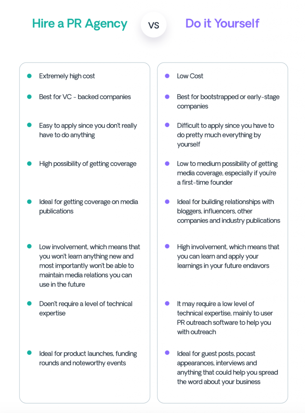
Image Source: Respona
There are only two colors used that match the branding of the tool.
To put it simply, you should think of color as a strategic element that can help you convey your message in an understandable and interesting way.
For that reason, you should avoid using colors that don’t match, using only one color, or using too many colors.
In terms of style, less is more and you should always try to keep some balance when creating your infographics.
Here’s tip number two.
Tip #2: Think of your infographic title
The second tip we’d like to share with you is to think of your infographic title.
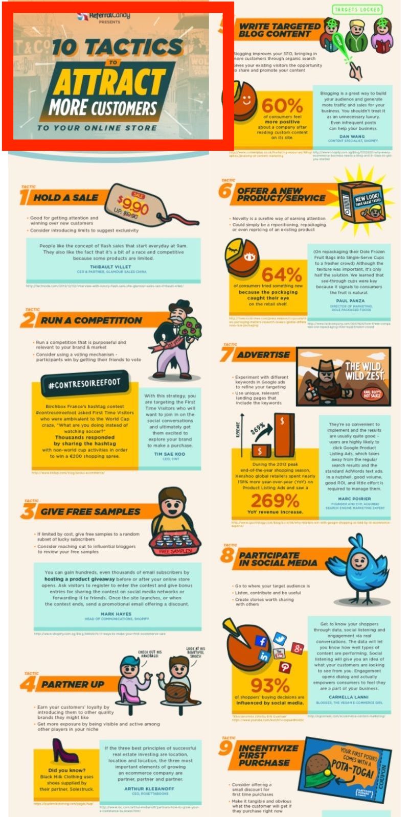
Image Source: Referral Candy
There’s a great chance that as the reader scrolls down your post, the first thing that they’ll see is the title of your infographic.
That shouldn’t mean that the title needs to be extra loud, but it does mean that it needs well made and thought through.
Also, be sure that it’s aligned with the rest of the graphic and maintains the consistency of the content in terms of style.
Apart from the design aspect of it, the meaning and use of words is also of great importance.
To cut a long story short, try your best to find a title that’s compelling but also understandable and engaging.
Tip #3: Take extra care of size and scale
Another tip we think it’s really useful to share with you when it comes to creating your own infographic is to take extra care of size and scale.
Size and scale can affect the overall appearance of your infographic, thus affecting its efficiency in regards to getting your message across.
Here’s an example that beautifully captures the idea of the right and efficient use of size and scale.
As you can see, the text has been strategically used in a size that almost immediately catches the eye in an attempt to introduce the viewer to the content of the infographic right away.
Additional visual elements, like the icons, red lines, and numbers are maintaining a sort of hierarchy that helps direct the gaze of the viewer.
To put it simply, try to think of the size and overall scale of your infographic as an element that you can strategically use to your advantage.
Then, just go for it.
Keep reading to find the next tip.
Tip #4: Use a specific number of fonts
The fourth tip in our list of seven tips for beautiful infographic design is to use a specific number of fonts.
Similar to what we mentioned about the use of a predetermined color palette, a limited number of fonts will make your infographic consistent and easier on the eye.
In fact, our advice would be to choose your primary font and then a few complementary fonts that can make the graphic more interesting and help you differentiate between different types of content within it.
Tip #5: Use graphs and images
This is one of the tips that’s to be expected, given the examples we’ve shown you so far in this post.
That is, to use graphics, charts, and icons to boost the efficiency of the visual aspect of your infographic.
In all the infographic examples you’ve seen here, there’s always been a number of graphics, charts, icons or other images included in them.
There must be a reason, right?
Let’s have a look at some beautiful graphs we found on the BetterProposals blog.
Image Source: BetterProposals
In this case, compelling and well made graphics are used to invite the reader to stay longer on the website and possibly to read more blog posts.
There are so many cases where graphics are placed instead of text or to complement text.
Companies and professionals are using graphics and icons to make their websites, portfolio websites, social media pages, blog posts, and so on and forth, more interesting to their audience.
Put another way, it’s to keep their audience interested in what they have to say.
For that reason, always remember that in order to make a killer infographic you need to add visual elements that’ll keep the viewer engaged without overdoing it.
Here’s tip number six.
Tip #6: Don’t forget to add sources and contact information
Our sixth tip is a very simple one.
Always try to remember to add your sources and contact details at the end of your infographic.
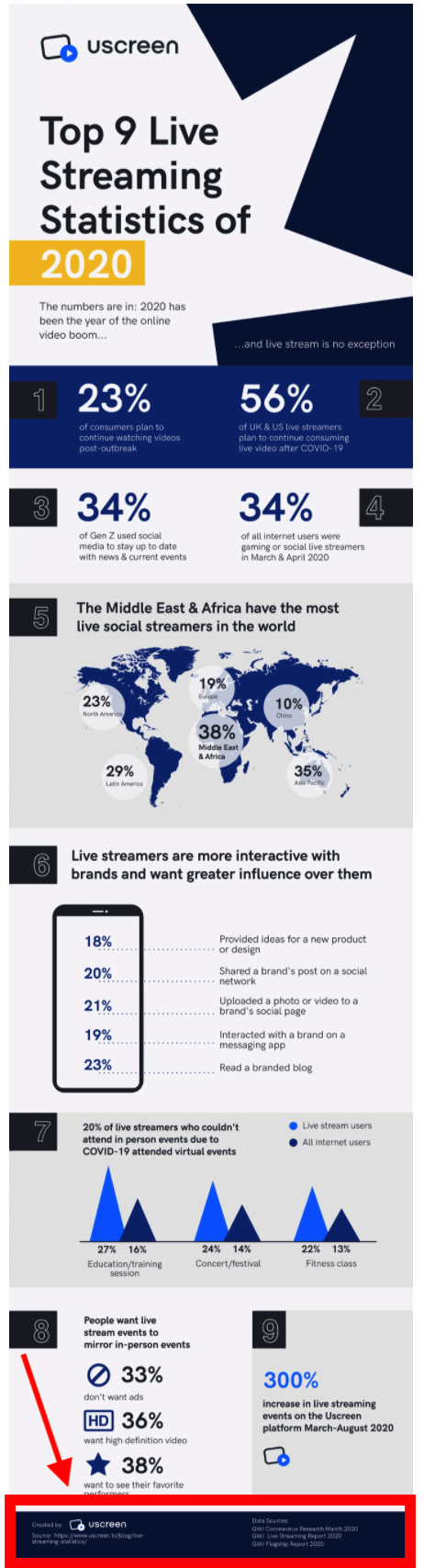
Image Source: Uscreen
Like you do with any kind of content you’re taking from someone else, mentioning your sources is essential.
Moreover, adding your contact information will allow people to get hold of you in case they want additional information or simply love your infographic and want to congratulate you.
As simple as that!
Tip #7: Use an infographic creator
Our final tip, and probably the most important in terms of saving you valuable time is to use one of the best graphic design software.
What an infographic creation tool will do for you is to provide you with all the necessary graphic design tools and customizable templates.
It might also give you access to premade graphs and charts and color palettes to choose from.
To put it simply, such a tool can save you both time and money and help you achieve a successful result when creating your infographic. You can also use a flipbook tool as a PDF infographic alternative to present your infographics in an interactive way.
Let’s wrap this up and close with some final thoughts.
Conclusion
There you have it.
A list of seven useful tips you should keep in mind when creating your infographics.
In this post, we’ve talked about how to use infographics in order to elevate your content and make it more fun and engaging for your audience.
In other words, we discussed how data visualization can provide an alternative for transmitting information in a more digestible and direct way.
We hope these infographic examples and tips inspire you to create the best infographics and incorporate them into your content.
—
 Bio: Payman Taei is UI/UX designer and the founder of Visme, an all-in-one visual communication platform empowering everyone to create and share beautiful interactive presentations, infographics, and other forms of engaging content with no design skills. He is also the co-founder of Respona, the all-in-one PR, and link building tool that combines personalization with productivity.