Carving out a place for your app is not an easy task. Most markets are already saturated with multiple solutions, so if you want people to even consider your solution, you will have to bring something new to the table and find a way to make your app stand out.
A staggering 60% of apps listed on the Google Play Store have never been downloaded, and only 20% of those that do download will ever become active users, so tackling app development and design is a task that won’t be easy to succeed on.
However, at the same time, mobile app revenue is set to reach almost 600 billion U.S. Dollars in 2020, so those that manage to break through and find an audience will reap enormous benefits.
But what’s the main difference between apps that instantly take off and those that struggle to acquire and maintain users? And how can you maximize your chances of success?
To answer these questions, let’s look at the most important aspects of developing an app and achieving the goals that you set out.
Start with the User
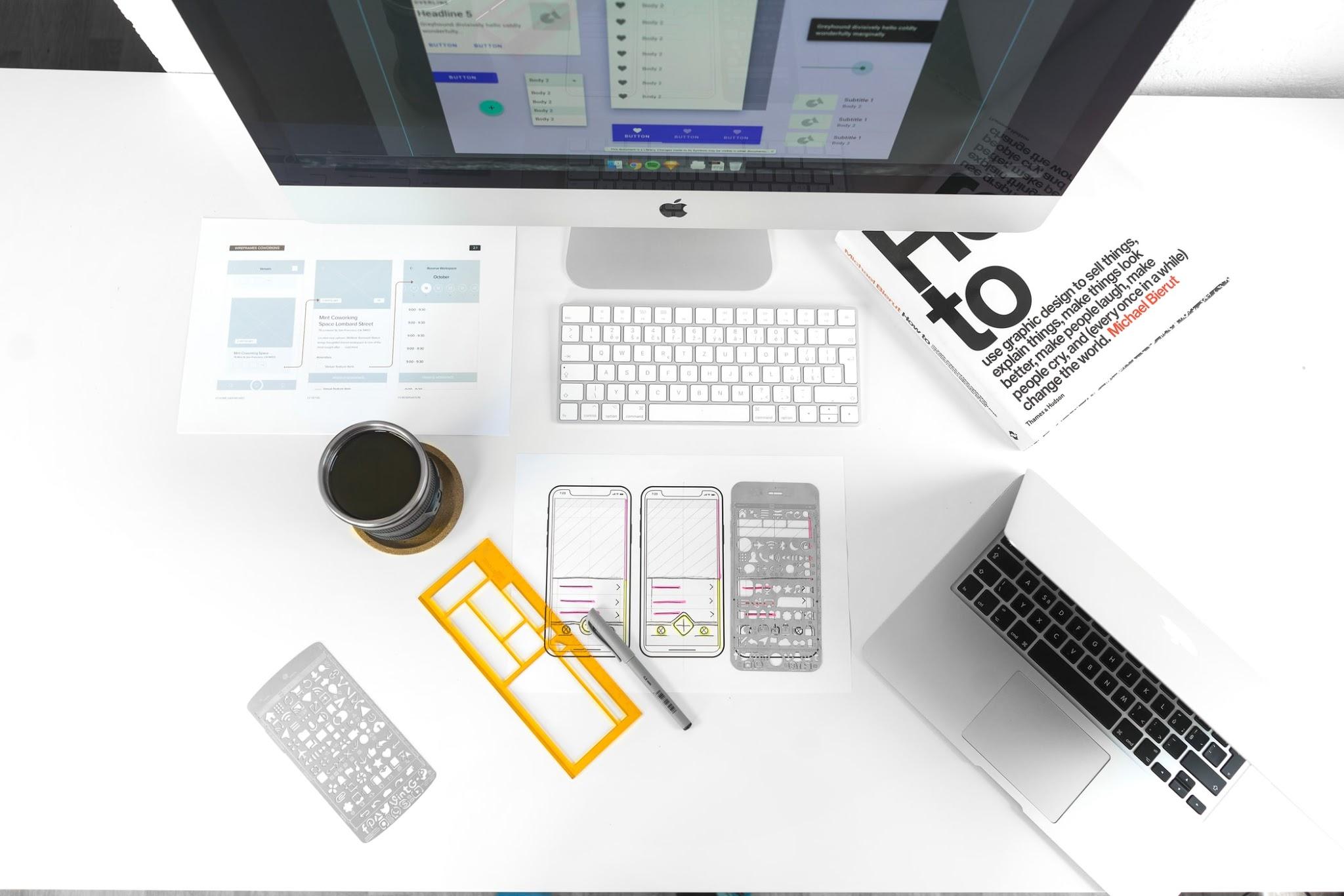
When figuring out how to create an app, there are a range of things you must consider. You need to find a catchy name, customize the design, add in the necessary features, and perform rigorous testing. As you can imagine, creating an app requires quite a bit of effort, even if you use an app builder that can simplify parts of the process.
But before you can even get into any technical details of designing your mobile app, you will need to take a step back and carefully analyze the primary purpose and the main users that your app is going to cater to.
Apps come in all shapes and sizes, but while they may be completely different, useful apps are based on designs that cater to their users and make their experience as seamless and convenient as possible.
Sometimes, that might mean that your app will need to have dozens of features and even customization capabilities. But more often than not, you will find that simplicity, ease of use, and clear purpose will make an app more popular and easier to promote to your user base.
To get a better idea of how to approach your project, look at who the people you want to reach are, how they interact with your brand, and what devices they use.
If you’re targeting a younger generation of users, you can get away with developing more complex features or using sleek design or navigation elements. But even then, justify every single decision you make based on the functionality and purpose of the app.
On the other hand, if you’re catering to a generation that’s a bit older or not as tech-savvy, your app will need to break through many barriers to even be considered, so you need to be extra careful about how you structure it and what you end up including.

Every hurdle that your app users have to overcome will significantly reduce the chances of them using it frequently, so it’s usually better to err on the safe side and ensure that your app does what it needs to before even considering more advanced features.
On the other hand, if you align your app design project to meet your audience’s expectations and needs, you will find that even though your app will be less established, it will have unique advantages over the competitors that will make switching much more appealing.
The key thing to remember is that your app should make taking the action that you want your users to take as easy as possible. So, the fewer distractions and non-vital options that the user has to sift through, the better your app’s performance is going to be.
Aim for Consistency Across Platforms
As a brand, you want your audience to form strong associations about your company and what can be expected when dealing with you.
Therefore, while your app may be a separate project from your website and your other platforms, you should make sure that your users’ experience is consistent with what they are used to.
Sure, that means that you should aim for the design elements to match and complement each other on all devices, but the appearance is just part of the puzzle, at least if you want your app to truly enhance the experience of your users.
For one thing, if you offer cross-platforms services, make sure that your app and website are synced and transfer user information so that they can consume the content on the go, customizing their experience in real-time and not having to worry about different configurations on different platforms.
Another important consideration is the navigation. Obviously, the user habits and preferences will be quite different on a desktop computer and a mobile phone. Still, even though you should adjust based on these differences, you should also try to maintain a similar logic so that they can access different parts of your app.
You don’t want to confuse or frustrate users who are trying to adopt a new way of interacting with your company.
Sometimes, your app might be able to provide exclusive features that aren’t possible on your site, which can actually be a great way to nudge your users to try out the app in the first place.
However, while it’s clear that the functionality will likely not be identical or even overlapping, both your website and your app should aim to satisfy the primary needs of your audience, even if they do so in different ways.
Simplify Usability
If you want your app to be popular, make it simple to operate on the go, with one hand, or even using just one finger. Any unnecessary or inconvenient actions that your users perform will put them off from using your app again since the primary reason people opt for apps in the first place is convenience and accessibility.
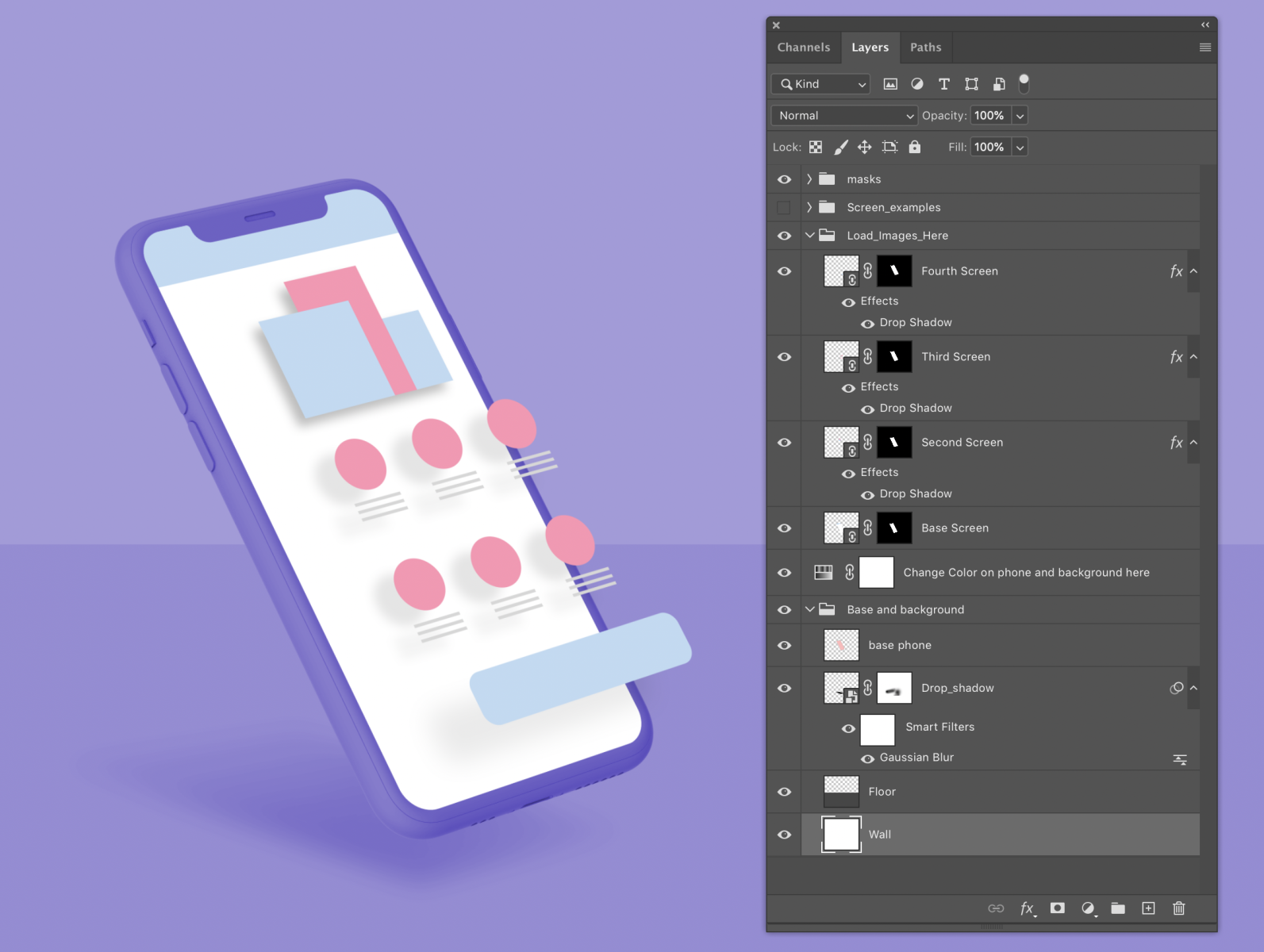
Free Exploded Mockup by Jonathan Levy, Image Link
You’ve probably encountered apps that require you to type in excessive amounts of information or have buttons too small or too difficult to click on in a hurry.
These are instant turn-offs for the majority of your prospective users, so while having people put in the information themselves might seem convenient for you, it will likely make many people turn off your app and look for alternative options.
Luckily, you can usually find creative ways to get the necessary functionality while still providing a seamless app usage experience.
A quick and straightforward solution is to design your navigation in a way that’s easy to click with the thumb – a significant portion of people primarily use their thumb for navigation, so keeping that in mind will help people browse and find what they’re looking for with less effort.
Using auto-complete and intuitive suggestions when typing can also be helpful. Every second you can cut down from the time it takes to complete an order or perform the action that you want will increase the likelihood of your users going through with it.
And while you may want to squeeze as much information as possible into the pages on your app, you should be mindful that even though screen sizes are increasing, there’s still only so much you can reduce the font size until it becomes a hassle to read.
If you need to display a lot of information, consider how you could space it in a way that makes it easy to go through by scrolling or swiping across pages.
Have a Strong Call-to-Action
While you want your app to satisfy your audience’s needs, as a business, your primary goal is to get people to perform the action that you want them to.
Whether that’s making a purchase, registering, using the app’s features, or anything else, you want the majority of people that open your app to end up going through the steps necessary to become a loyal and frequent user.
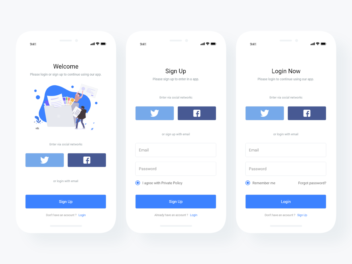
Login and Sign Up Page by Aksenov Jean, Image link
That’s why figuring out how to display and structure your call-to-actions (CTAs) on various sections of your app is absolutely essential.
For one thing, that’s essential for your app usability and effectiveness. But it’s also a crucial part of making your app easy to navigate and use, especially since it’s likely that the vast majority of users will download your app for a very specific purpose.
So, if you have an app for your online store, the “add to cart,” “go to checkout” or “finalize order” buttons should be prominently visible, easy to click with the thumb, and big enough so that users don’t struggle with trying to press it.
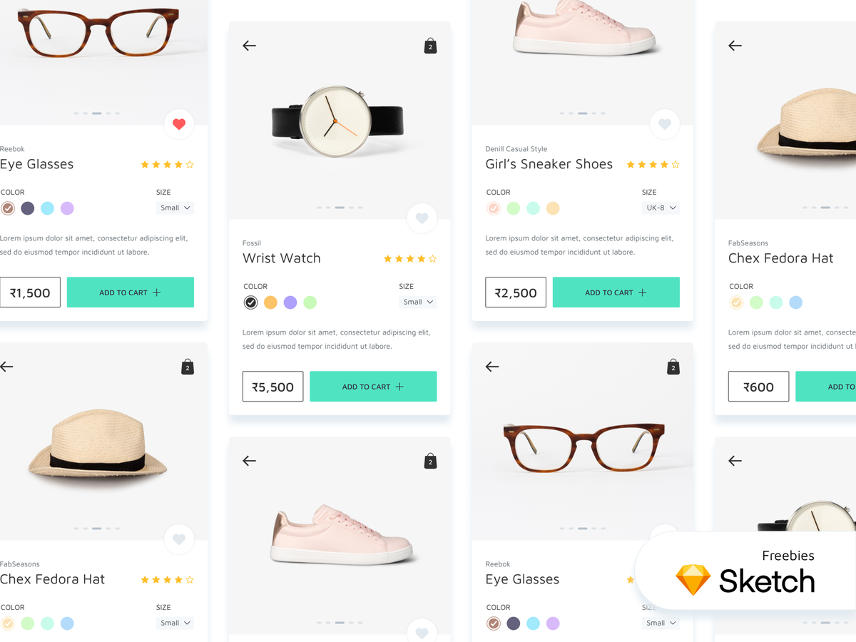
Freebies: eCommerce Mobile App – Product Screens by Shreyash Barot, Image Link
Make Your App Efficient
Mobile devices are becoming more powerful every year, but they are still limited compared to desktop computers in terms of how many processes they can run at once.
Therefore, making your app efficient and easy to use should be at the top of your priority list, as every additional megabyte that your app takes up will have to be justified in the eyes of the user that’s cleaning up their phone’s storage or deciding which app to download.
What’s more, a clunky and slow app will also put a strain on the user’s battery, which can make people hesitant about using your app, especially when their phone is low on power.
In fact, Google recently admitted its blunder of recommending designers to use white-colored backgrounds in their apps, which was later discovered to cause significant battery drain. So, don’t be afraid to use darker colors, as that will help the app use up less energy.
If your app requires background functionality such as location detection, try to limit its use to when it’s actually necessary, as running resource-draining functions for prolonged periods can also cause a significant drain on the smartphone’s resources.
Test Out Your Design
Developing an app’s UI is a long and challenging process, and you’ll have plenty of obstacles you’ll need to overcome before the app is even remotely close to being functional.
Because of how long the process can take, you might be tempted to push the app’s launch to as soon as possible, as you’ll probably want to finally reap the rewards for all of your efforts.
However, if you launch an app that isn’t ready, you will almost definitely end up frustrating your users and dooming your app to fail from the start. Even if the app was looking functional and ready, without proper user testing, you would likely miss vital functionality or performance issues that can make the app completely unusable.
Luckily, you can use a proven mobile UI testing checklist to ensure that your app is ready and meets your audience’s expectations.
Remember, you’re not only testing the app itself, but also how it will perform on various devices that can vary in size, specifications, operating system, and various other factors.
You will need to ensure that your app can adapt to different resolutions and screen sizes, which will probably require adjusting the layout and visual elements to suit various screen options.
Even the color schemes can vary significantly from device to device, so it’s essential to use a wide range of devices, either in real life or through emulators, to discover how your app is able to perform and ensure consistency throughout.
If you perform rigorous testing, you will significantly reduce the chances of major errors making it to the launched app. Still, be prepared to quickly address any issues that arise during the first few months since launching the app, since it’s likely that you won’t be able to find everything without allowing your users to challenge the app’s performance on a larger scale.
If you are thinking that UI & UX are the same. You must check out this article on the difference between UI and UX design.