
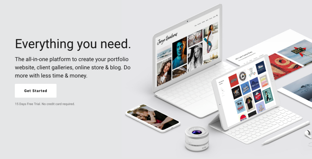
Great website design is essential to any business, and that includes creative professionals. Whether you’re a writer, photographer, or graphic designer, a great website is essential if you want to land the kind of quality clients your hard work deserves.
Read on to learn a few easy tricks you can use to improve the user experience of your portfolio website, giving you the best shot at converting site visitors into customers.
Let’s get started.
Add plenty of visual and video content
The human brain can process visual content faster, and retain it longer, than written content. Around 90% of the things we remember are visual in nature. It’s easier to recall a video you watched than to remember lines from a play. For that reason, you must include plenty of visual content on your website. Video is even better.
If you’re a visual artist, designer, or photographer, your website must feature your own work. After all, your audience wants to see what you’re capable of. Original art and visual content make your site stand out from all the others out there and immediately puts your skills front and center.
Peter Alvey is a freelance photographer, and uses an original image from his portfolio on the front page of his website to showcase his skills:
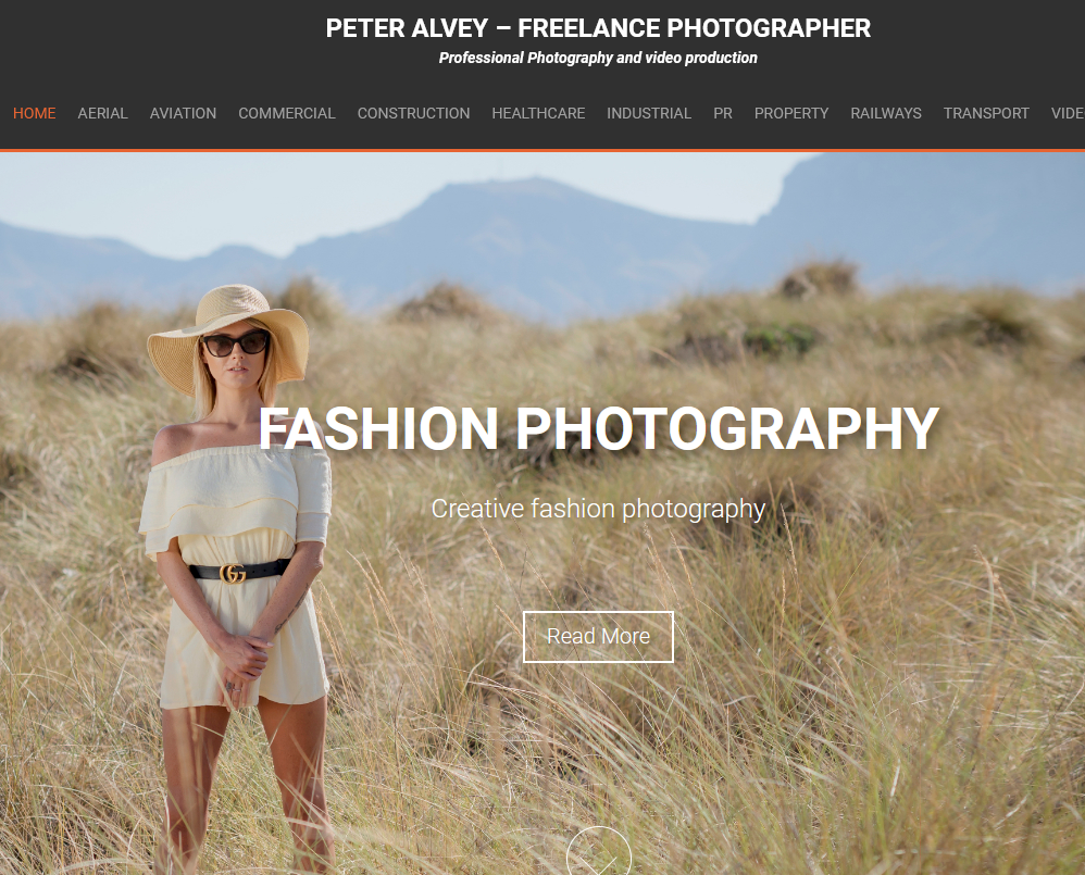
(Source)
The photos are on a scrolling carousel, meaning anyone who lingers on the site will get to see several examples of Alvey’s work.
Paul Horton is a fine artist who takes a similar approach, displaying rotating examples of his work on his homepage:
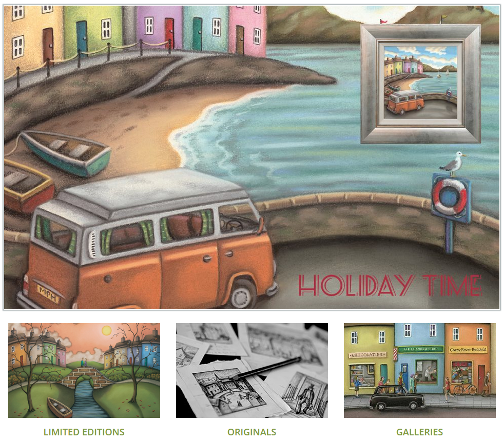
(Source)
Because your potential customers are bombarded with thousands of messages each time they browse the internet, you need to connect with them in a memorable way. As the saying goes, a picture is worth a thousand words. This is especially true in the world of creative professionals who knows how to work with the best color patterns.
Keep the homepage free of clutter
Website visitors have an average attention span of around 8 seconds. That’s all the time they need to decide whether they want to learn more, or leave your website and go elsewhere. Therefore, you need to make sure that the right messaging stands out as soon as they land on your homepage.
That means keeping your homepage clean and free of clutter. Appropriate visuals, short and simple copy and a clear navigation menu are the way to go.
Here’s how Pentagram, the world’s largest independent design consultancy, does it:
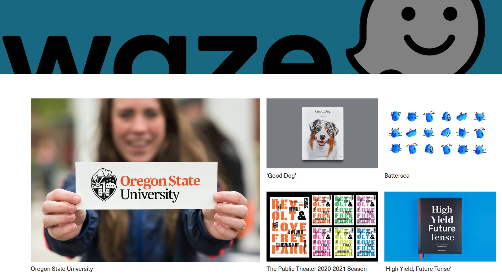
(Source)
The company dedicates its homepage to showing off past projects using plenty of appealing visual content and a simple top-of-the-page navigational menu:

You can’t afford to turn prospective customers off the moment they land on your home page. It’s easier to promote your website when it’s easy on the eyes. Instead of cluttering up your homepage, use concise content, appropriate images or videos, and plenty of white space.
Make it easy to navigate
When you design your website, you’ll need to ensure that site visitors won’t have a hard time getting around it. If they cannot easily find what they’re looking for, they will go elsewhere. On the other hand, a website that’s easy to navigate can help you with both lead conversion and customer retention.
Most users expect to see a navigation bar either along the top of the screen or in the sidebar. Web designers put menu bars in these strategic locations to make them easier to find.
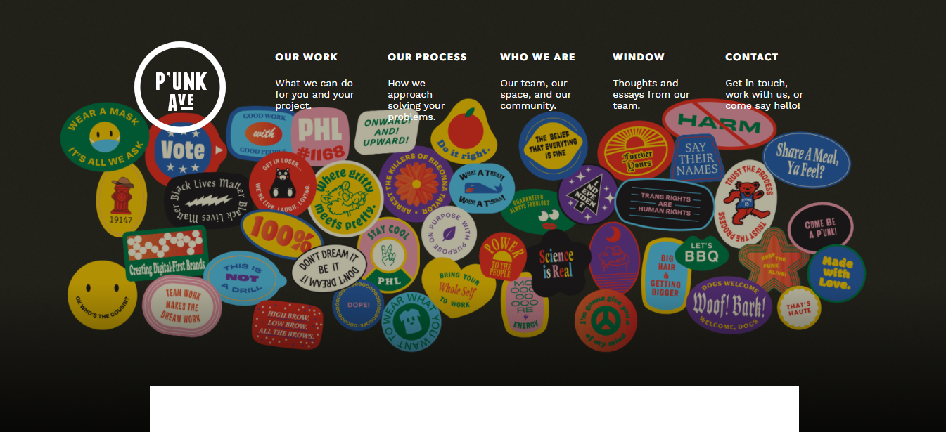
(Source)
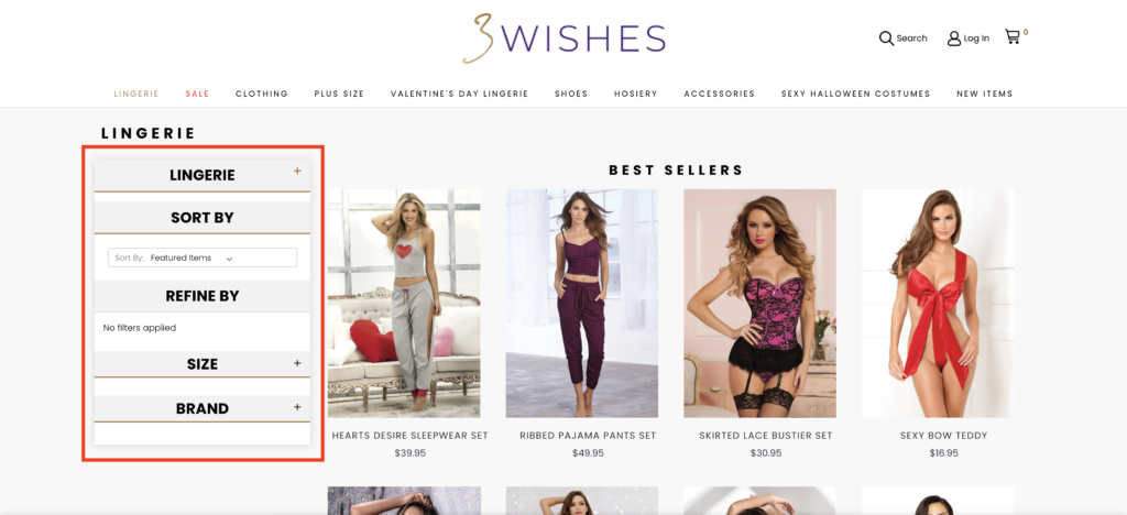
Punk Avenue’s website (above) is a good example of simple website navigation. The menu bar contains just a few items, and each has a short description of where it leads. If you’re running an eCommerce site like 3Wishes (a lingerie store) for example, consider using the navigation in the sidebar and make it as easy as possible for your users. As you can see in the screenshot below they filter by lingerie, size, brand, sort by and refine by.
An easy-to-navigate website invites the user to explore and find out more about what you have to offer. Clear navigation bars and clickable logos help website visitors find their way around. As a creative professional aiming to get clients, you’ll want to link to your portfolio, blog, and “contact me” page in easy to find locations.
Ensure that your CTAs are visible and easy to find
What’s your goal in building your website? Presumably, it is to showcase your work and find new clients. Whatever your goal, you’ll need a clear and visible call to action (CTA).
Your CTA should be prominently located, easy to find, and you would want to minimize the need to scroll down. As much as possible, keep them within the fold — the space that’s immediately visible once you open the page. In addition, they should stand out from the rest of the page and content so they’re easy to find.
Here’s how graphic designer David Almeida does it:
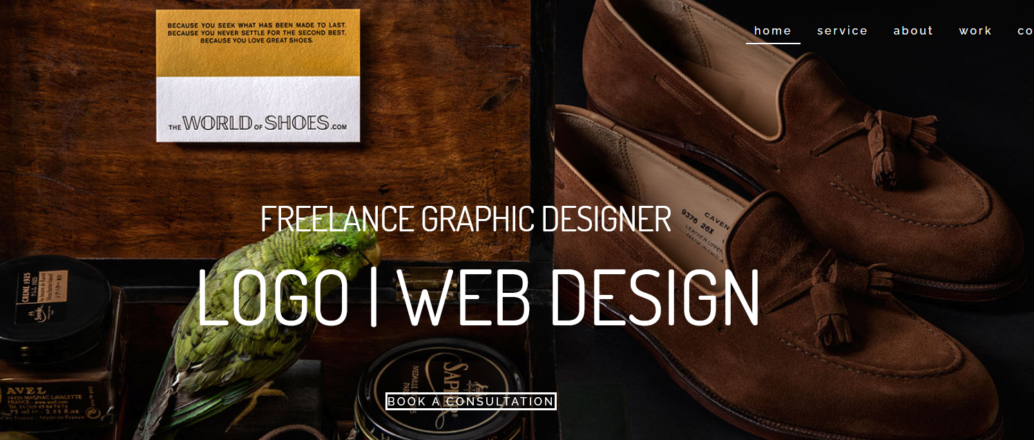
(Source)
The call to action (“Book a Consultation”) is front and center, and the ask is clear. It’s also a relatively low barrier to entry for a prospective client. A consultation implies discovery and deciding whether this particular professional is the right one to work with. Why not include a similar CTA on your site?
Use responsive design principles
There are over 3 billion smartphone users globally, and over half of internet traffic now comes from mobile devices. Therefore, if your website doesn’t give its mobile visitors a great experience, you risk losing half of them straight away!
If you intend to create a sales funnel for mobile users (which you absolutely should!), this is where responsive design comes in. Responsive web design includes flexible text and images, and media queries which specify the HTML or CSS code to use according to the screen size and orientation. Strong responsive design ensures that a website will look great and worth seamlessly, regardless of the device used to access it.
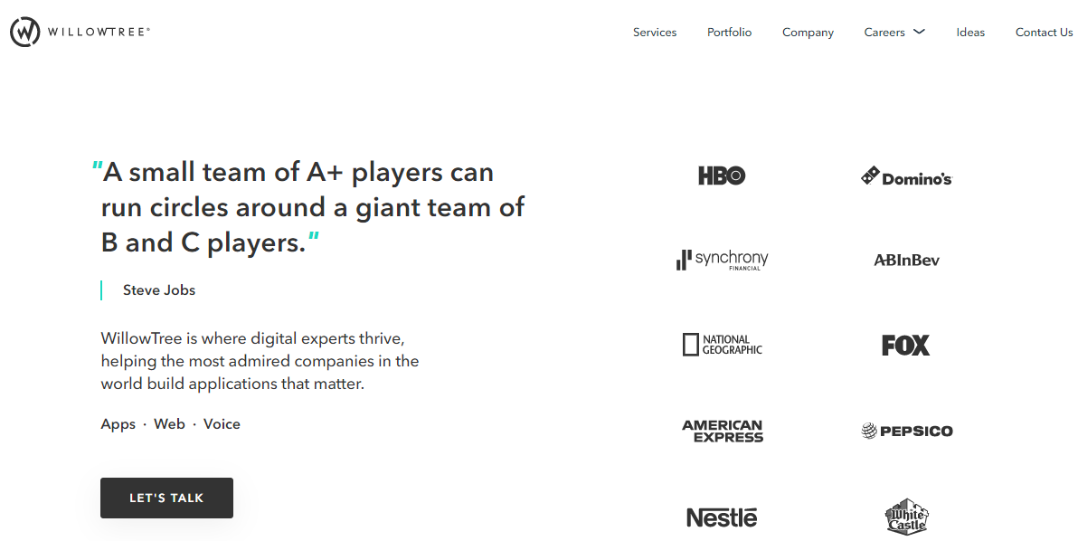
To give you an example of how it looks, here’s the website for Willow Tree Apps, a company providing digital products to businesses:
And here’s the mobile version:
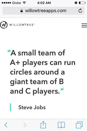
(Source)
You’ll notice that there is not much difference in terms of the font and images used, and that the site doesn’t look distorted on the iPhone. That’s because WillowTree uses responsive design that detects the size and type of device, and resizes web design elements to adapt to the screen size and orientation. The client logos visible on the right in the desktop version are positioned further down the page in the mobile version.
Here’s another great reason you must go responsive: it helps with your site’s SEO. Google has recently rolled out a change to its algorithm that ranks responsive websites higher in the search results than non-responsive sites. So if you want people to find your website and then stay on it for long enough to consider hiring you, you must make it responsive!
Give visitors multiple ways to get in touch with you
Many creative professionals are shy about self-promotion. As a result, they tuck their “Contact Me” page away in a corner or at the bottom of their site. However, this is a big mistake. Your contact form or contact page must be immediately visible.
You should also give your clients multiple ways to contact you. If possible, include a contact form as well as your phone number, email address, and social media details. Adding a chatbot app to your website will give your site visitors another option. A chatbot can provide answers to the most frequently asked questions, reduce the amount of time you spend replying to emails, gather basic information about the prospective customer, and fuel your sales by making offers based on the customer’s budget.
Wrapping up
Your website is the single most valuable piece of real estate you have when it comes to attracting leads and landing new clients. It should reflect your brand personality, showcase plenty of your work, and invite potential customers to learn more about what you do.
But your site must also be as user-friendly as possible, something that creative professionals often forget. In closing, remember my top tips:
- Use visual and video content, ideally of your own creation
- Keep your homepage clean, concise, and clutter free
- Ensure users can navigate around your site with ease
- Responsive design is essential
- Give visitors more than one way to contact you
Now that you have a better idea about the things that make up a great website for a creative professional, you can start building one that will proudly show off your work and help you achieve your goals. We’re eager to see what you can come up with!
The post is written in collaboration with Ian Loew. He is a web entrepreneur and inbound marketing expert, and the Owner and Creative Director of Lform Design.