A website is a critical aspect of brand identity in this digital age. It helps visitors find the information they need to make a purchase decision. But a website with poor UX design can create navigational complexities, impacting user experience and engagement.
Reports state that 25 percent of visitors leave websites without buying anything due to poor UX. So, paying attention to the user journey and creating a business website with good UX design is vital to boosting conversions. This step can further lead to improved buying decisions, resulting in high ROI for businesses.
In this post, we have shared six easy yet effective ways that businesses like yours can use to improve the UX design of the website.
#1: Design Responsive Website
In this age of digital transformation, customers are active on multiple devices. Hence, designing a responsive website is critical. Responsive web design is all about revamping a website to make it work across several devices, such as laptops, mobile phones, tablets, and others.
A survey affirms non-responsive design is one of the top reasons visitors leave a website. What’s more? There are over 7.1 billion mobile users across the globe. A non-responsive site can cost businesses, valuable customers. Even Google has started penalizing non-responsive websites. So, the responsiveness of a website is significant to business success. Brands can check their site’s mobile-friendliness here.
#2: Make the Design Simple and Clutter-Free
Around 94 percent of potential customers judge brands by visiting their websites. A cluttered website with too many design elements can confuse the visitors, leaving a negative first impression of the business. So, designing a website with the utmost clarity is imperative.
Creating highest converting landing pages involves ensuring that it reflects brand value rather than come across as overly-promotional. They should help the visitors extract information without any distractions, thus driving them towards making a decision.
Here are a few tips for creating a clutter-free and eye-grabbing website.
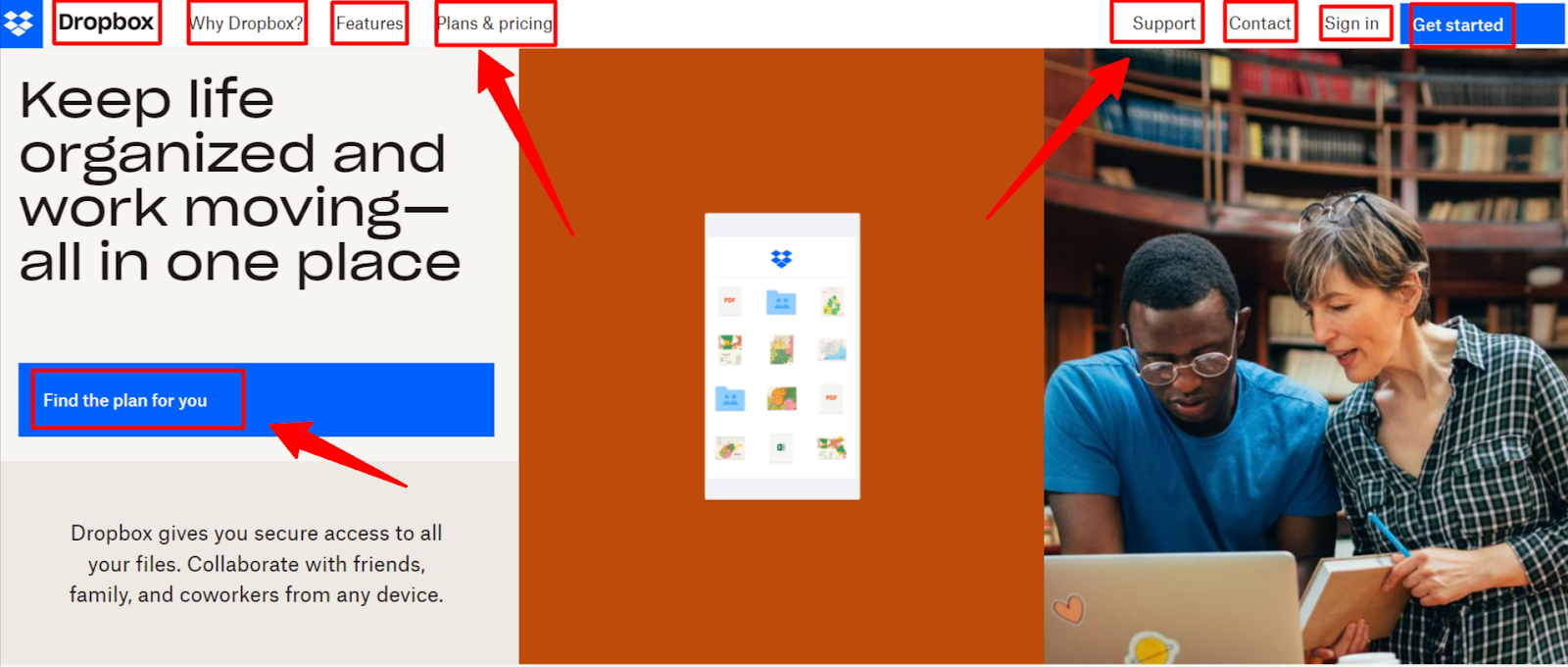
- Maintain Relevancy: Don’t overcrowd the pages with products and services. Only add relevant sections that offer value to the customers. For instance, notice the following screenshot of Dropbox. The marketing copy highlights the value proposition of this SaaS tool, and the sections help users proceed further.
- Color Scheme: Colors can impact the decision-making of users. Go with standard colors like red, purple, blue, green, orange, and black for a better user experience and conversions. Take a look at the following screenshot of Microsoft’s website.
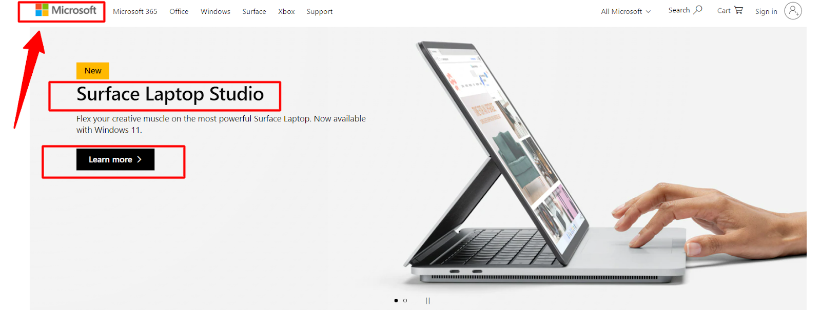
Observe how the SaaS giant uses a combination of standard colors to enhance the UX experience of visitors.
- Font: Try using easy-to-read fonts. It helps users to scroll hassle-free, thus improving content readability. For instance, notice the following screenshot of Amazon’s website.
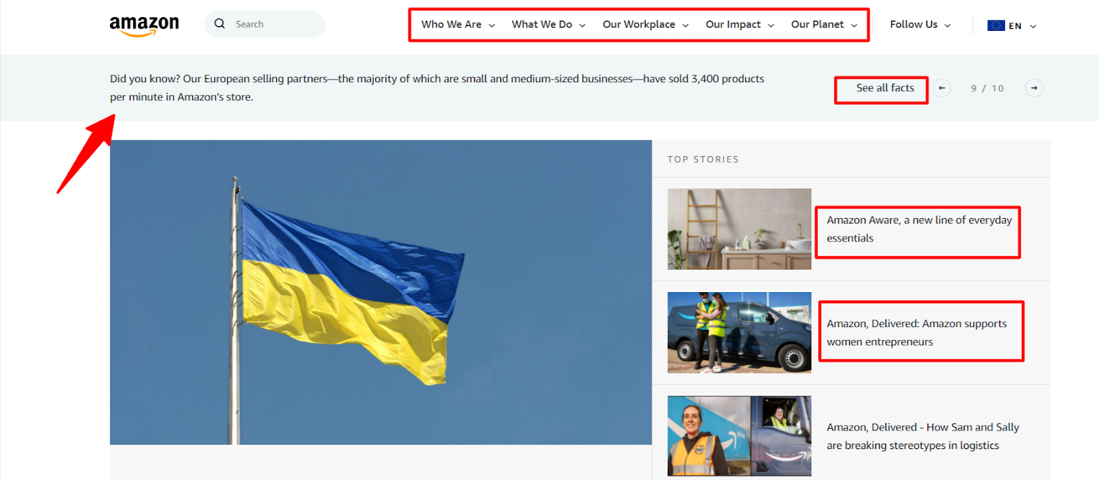
See how Amazon uses Arial font for simplifying the user experience.
- Navigation Menu: Don’t let users wonder where to search for products or information. Keep the navigation menu simple for a great UX experience. Ideally, every page shouldn’t be more than three clicks away from home.
- Customer-Centric Approach: Every design element included on your website must be customer-centric. For instance, notice the following screenshot of HubSpot’s website.
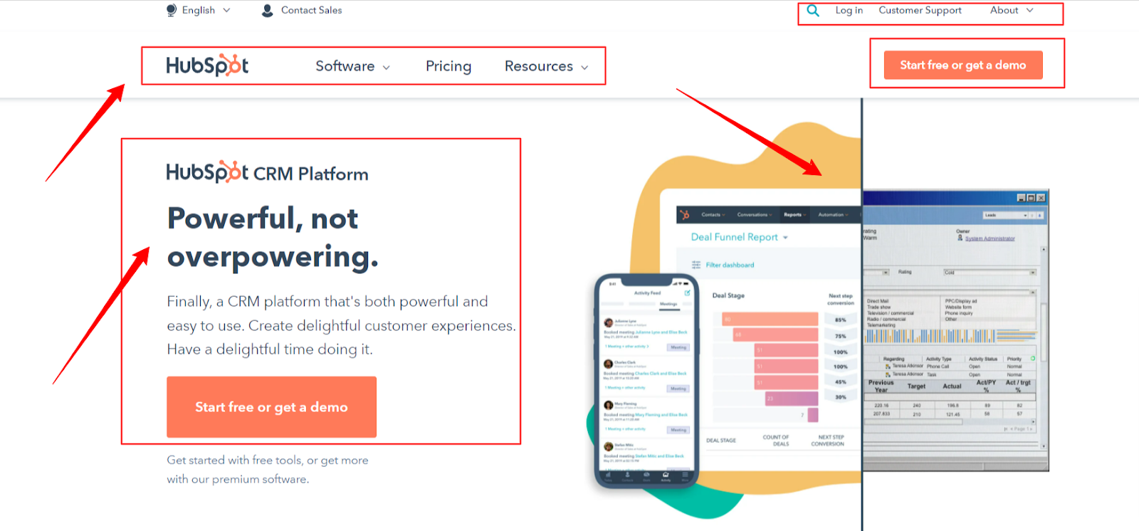
Observe how they have incorporated the best tactics to design a clutter-free yet engaging homepage. The design speaks volumes about their customer-centric approach. Follow a similar approach and create clutter-free pages for your website.
#3: Optimize the Page Speed
Page speed is one of the most crucial parameters of UX design. In fact, it is used by Google to rank pages in the SERP. Google evaluates the response time to click buttons. It maps how fast the images and other content on websites load. Simply put, it focuses on user interactions.
Why does Google emphasize loading speed? Long waiting times can frustrate visitors, resulting in a high bounce rate. This sends a signal to Google that users aren’t enjoying the experience on the web page, thus impacting your credibility and ranking. A report advocates that page speed impacts the buying decision of 70 percent of customers. No business would like to lose such a massive number of consumers.
Here are a few tips to optimize the page speed of the website.
- Enable Compression: Compress heavy CSS, HTML, and JavaScript files before uploading them on the website.
- Reduce Redirects: Unnecessary redirects consume visitors’ time, providing a slow UX experience. Work on minimizing them.
- Leverage Browser Caching: Browsers cache data and information such as images, JavaScript files, stylesheets, and more. It allows visitors to load the website fast when they revisit. So, make use of cache information to simplify users’ experience.
- Optimize Images: Optimize images by compressing them in the appropriate format. It can help make the page speed fast.
A great example of a website with fast loading speed is Neil Patel. The website loads within the blink of an eye, thus, serving users with the information they need. Here’s the PageSpeed Insights Report by Google for this website.
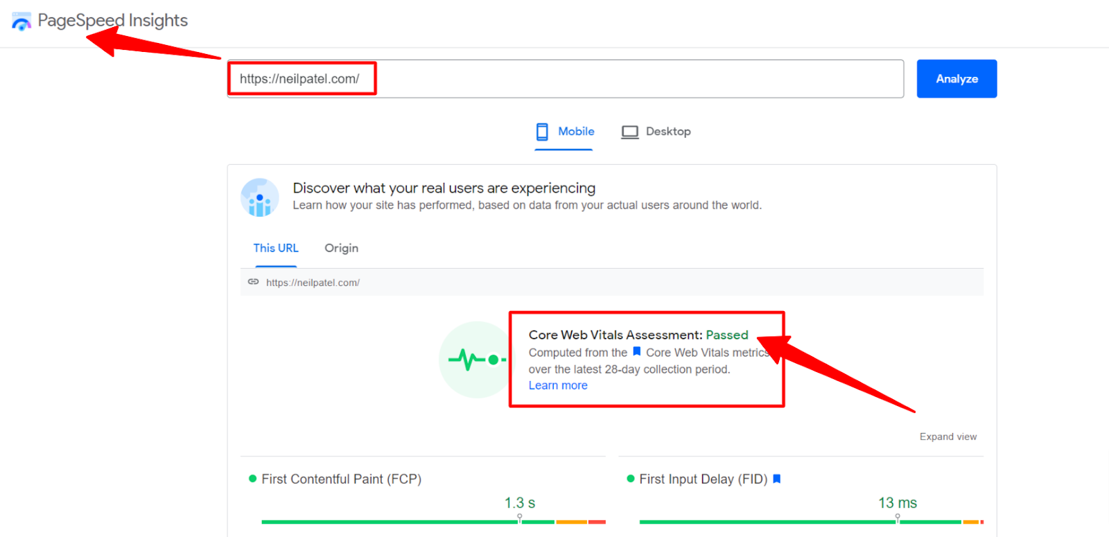
Make sure your website also loads fast.
#4: Use Attractive CTAs
Call to action (CTA) is a visual cue that encourages visitors to take action for moving forward. Its purpose could be to take users to the contact page, inquiry page, or buying the products and services. Simply put, this visual element simplifies the navigation of target audiences. For instance, consider the following screenshot of WUFOO.
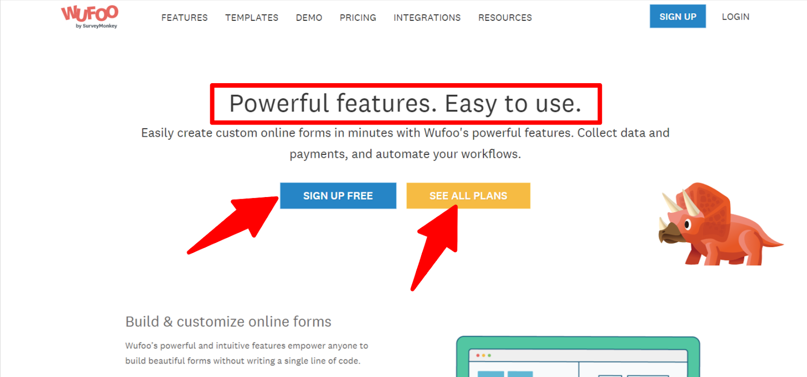
Notice how the company has created simple-to-understand CTAs. Observe their supporting text. The content is crisp and engaging. The motive is to help users proceed with the next step.
Here are the best practices for creating actionable CTAs –
- Use Action Words: Using action words in the CTAs can result in sales. Try using the phrases shared below –
- Add to cart
- Sign up
- Click here
- Download now
- Get a quote
- Discover
- Focus on Supporting Text: Use time-sensitive language to create a sense of urgency. For instance, create a CTA with the text “Sign Up Now” to prompt users to move ahead fast.
- Pick Suitable Colors: Pick suitable colors that match the website’s theme. They can impact the psychology of users, encouraging them to buy something.
#5: Add High-Quality Images and Videos
Videos and images have the power to tell a brand’s story, keeping the user engagement quotient high. They can help brands showcase their vision, earning the trust of target audiences. But brands cannot expect to connect with visitors with substandard visual elements. Low-quality videos and imageries can disinterest users and question the credibility of your page. With advancements in AI, businesses can now go beyond traditional media creation. Tools powered by visual generation technologies such as nano banana 2, enable marketers and designers to create high-quality, customized visuals instantly. This allows for faster content production, consistent branding, and the ability to experiment with different styles without heavy design resources. Studies confirm that the quality of visual elements impacts brand conversion.
A great example of an appealing website is Jackson Galaxy Enterprises.
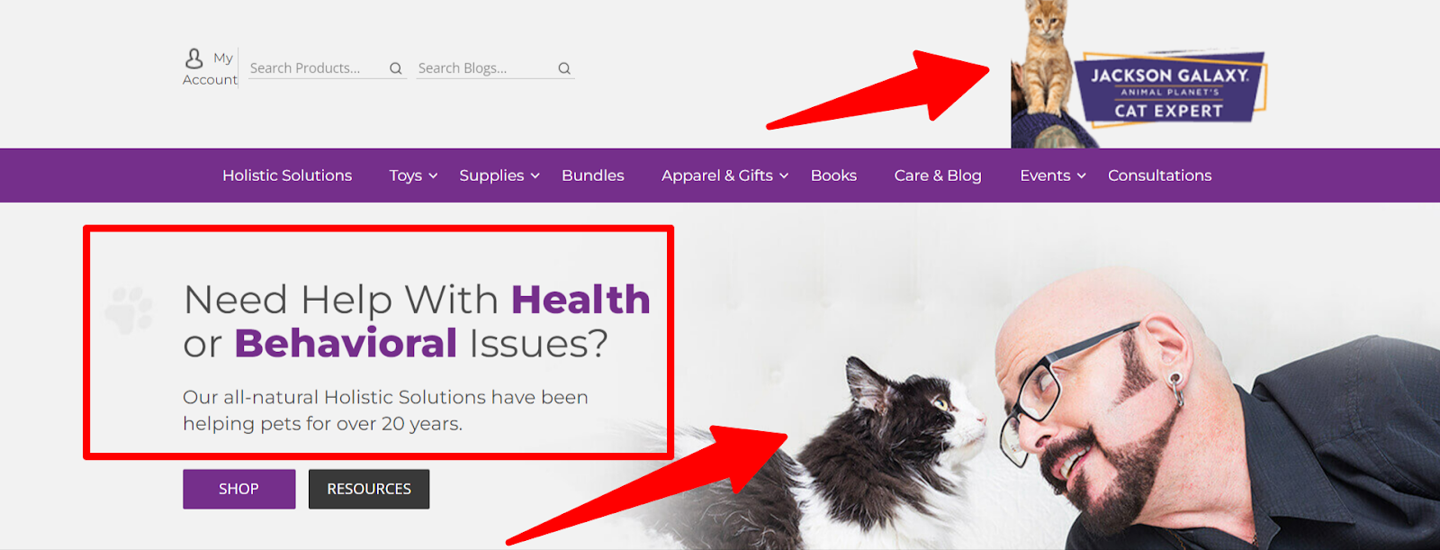
Notice the attractive images and videos they have. Through its meaningful UX experience, this website is sure to build authority in its niche. The lesson? Choose appropriate and high-quality images and videos for your website. They play a vital role in turbocharging UX strategy.
#6: Include Readable and Optimized Content
Great content adds value to customer interactions. It helps the website rank in Google search results and attracts quality leads to boost sales. Hence, businesses, small or multinationals, need to rethink content strategies. They need to check whether the content provides enough value to the customers.
Here are a few tactics to generate quality content.
- Readability: Create content that is simple to read and understand. It should educate visitors about the brand and its services.
- E-A-T Guidelines: The content should follow the E-A-T guidelines (Expertise, Authoritativeness, and Trustworthiness). Besides improving SEO, it offers in-depth knowledge to visitors, enhancing the UX experience.
- Bullets: Break the flow of content by adding bullet pointers. They make it easier for the readers to grasp the information.
- Titles: Keep the headlines and titles relevant to the pages’ content. Include 1-2 keywords in the title to help readers search for information.
Notice the following screenshot of Tilde.
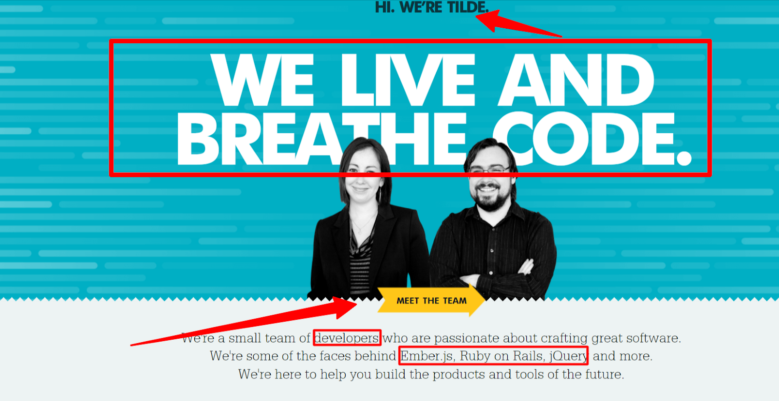
Look at how well they have optimized their content. From keeping it relevant and readable to adding SEO-specific titles, Tilde has done a commendable job. Focus on drafting such compelling content for your website.
Conclusion
Almost every business aiming at capturing leading and boosting conversions has a website. But building a website is not enough. The website should attract, engage, and convert visitors, thus proving to be an asset to your business.
The shared actionable strategies shared above can help businesses improve UX design. They are easy to implement and have the potential to transform any business. So, experiment with each of these UX design strategies and witness a positive impact on your business revenue!


