Writing effective emails is a key component of successful digital marketing campaigns. In addition to containing dynamic content, your emails should have some basic design features. The design elements you use in email campaigns will often determine whether or not the reader engages with the message.
If you want your customers to open and read your emails, you need a functional and engaging email marketing design and dynamic content.
Email design has many subtleties, which can make it challenging to grasp. However, with the right responsive designs, you, too, can create emails that deliver results.
What is email design and why is it important?
Email design means creating email communications that are both aesthetically pleasing and functional. Choosing the right typefaces, colors, graphics, and layouts can improve reader interaction and open rates. Effective design sends a clear message that catches the reader’s attention.
Your emails—no matter how important they are to you—are just one of many in the recipient’s inbox. Emails from personal contacts and even other advertisers are crowding that inbox. To stand out in the sea of messages, you need a design that is both relevant and attractive.
A well-designed email helps you incite an emotional response from the reader, build meaningful relationships, and close sales. So every company when sending mass emails should also look after the design aspect as it is an extension of your brand and the values it represents. It is an extension of your brand and the values it represents. The first impression your email design leaves on your target audience could go on to set the tone for the rest of the relationship.
6 email design elements for driving customer engagement
1. Composition
Size and form should be among your initial concerns when creating a new design. When designing emails for marketing purposes, a width of 550–600 pixels is optimal. This will make sure that most of your email recipients can view it correctly.
Your email’s overall height will depend on the amount of content you provide. It’s vital to remember that many receivers skim emails in a preview pane before deciding to open them. The height of the preview window in most email clients is only about 300–400 pixels; therefore, it’s crucial that you put all of the most crucial information there, such as a clear call to action.
2. Layout
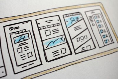
The layout influences the content flow of your email and dictates the sequence in which readers can view your message. Using a simple text block can hamper the impact of your message. Meanwhile, imaginative design keeps the reader glued to the screen and tuned into the message.
Choose from email design layouts like:
- Single Column Layout
- Two-Column Layout
- Three-Column Layout
- Grid Layout
- Zigzag Layout
- Full-width Image Layout
- Hybrid Layout
- Menu Layout
- Product Showcase Layout
- Storytelling Layout
Your email will be more accessible to everyone by using a single-column layout, and it will also be easier to read. Besides, most people check their email on their phones, so it makes sense to utilize a single or inverted email layout optimized for mobile viewing.
3. Negative space
Stark contrasts, white space, and pronounced silhouettes are all examples of negative space.
By being aware of this design principle and skillfully manipulating it, you can make your material more impactful and create an engaging visual journey that holds the viewer’s attention. As we mentioned earlier, most people use mobile devices (smartphones and tablets) to read emails, so you should avoid sending messages with too many photos or lines of text.
On mobile devices, even a small amount of white space can make a big difference for your readers.
4. Images and colors

The images and color scheme you use in your emails are often the first things recipients notice.
Using the right images and color schemes consistently in emails will not only improve customer engagement, it’ll also boost brand recognition. Your recipients can spot your messages easily in their inbox, and they’ll be more likely to open and read them.
Images
Visuals make your email more engaging. Including visual assets like images, logos, banners, etc.,is your chance to demonstrate the uniqueness of your brand.
However, it’s not advisable to just dump pictures into emails. When designing an email, it’s important to think about accessibility, file size, image load speeds, and relevant images to include.
PNG and JPEG are ideal if you’re using still images. You can try utilizing a GIF or APNG format for any animated imagery.
Images also have a big impact on email size. Compress images before adding them to your emails so you don’t overload the recipient’s inbox. Professional design software and free online tools (i.e., Adobe Photoshop and TinyPNG) can help you resize your images to ideal proportions. You can also use a background remover to further optimize images, reducing unnecessary elements and enhancing clarity.
To make your emails more visually appealing, you can also use graphics and icons, like social media logos. Icons serve as visual aids in a number of ways, including by highlighting list items and establishing a visual hierarchy.
Finally, when adding photographs, it’s important to avoid using imagery that doesn’t contribute to the message. Emails should only include appropriate, relevant images.
Keep copyright laws and licensing provisions in mind if you want to use stock photos. Only upload photos that you have received permission to use.
Color
Color is one of the fastest and most effective means of nonverbal communication. The science of color psychology has shown that some color combinations are more likely to appeal to certain demographics than others.
The colors you use in your email can affect the recipient’s impression of the message before they even start reading. This makes color an integral part of any email design project, where it is crucial to share an engaging, thought-and action-provoking message.
5. Typeface and Fonts
We can classify typefaces into two groups:
- Display types
- Text types
Display types are those used for email subject lines, headings, and other quick introductions to the main material, whereas text types are those used for the body of the text itself. The two are quite similar, with the only difference being the size and weight (font).
For most emails, the ideal widths for the display types and text types are 22 and 14 pixels, respectively. Both mobile device and desktop users will have no trouble reading text of these sizes.
Fonts
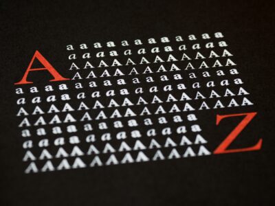
The font you choose should be consistent with how you want your target audience to view your brand. For example, a classic and traditional business that handles call center analytics could opt for Helvetica. However, you should probably choose OpenSans instead to project a more modern and youthful style for your business.
Just don’t go overboard. You shouldn’t bombard your email recipients with five different fonts in the same message. If you must use different fonts, try limiting it to just two.
Remember that you want both your typeface and font to enhance your message rather than overshadow it. Aim for a combination that pops out and is easily readable.
6. Strong CTAs
Your email should include a strong, clear CTA (call to action) that informs the reader of the next step they need to take. Perhaps you’d like your readers to make a phone call, make a purchase on your website, or sign up for your newsletter after reading your message.
Use a compelling CTA to show them how they can complete the desired action and add action buttons to make the next step clear and encourage users to click through.
Design compelling messages
The modern consumer expects nothing less than the best from their favorite businesses. To win a place in their hearts and build a successful email campaign, you should pay attention to the design elements listed above.
It’s your responsibility to catch their attention, communicate crucial information with minimal fuss, and develop a better relationship with your brand. If you implement these design elements in your email design, your readers will eagerly anticipate each message.
