Users prefer websites that are easy to navigate and have an eye-catching design at the same time. But how can you make your website easy to navigate? And what is considered an eye-catching design? Is it possible to correspond to both requirements? In this article, you will get the answer to all those questions.
What Is Considered To Be A Good Website Structure?
The key is making the website user-friendly. Make it clear and easy to use, also for first-time visitors. Potential clients prefer websites that offer the fastest solution for their problems. Each user likes websites that are straightforward. Do not confuse them with too many unnecessary features. Focus on the essential ones. No one is going to browse for hours to get useful information. Everyone would like to get it immediately.
 Place the navigation bars in a conspicuous position. Group the information into categories. Create subcategories that are logically connected to each other. Form the groups according to the characteristics of the service on your website. All the information should be right there where users are expected to find it.
As for the design, the best you can do is to avoid the glitchy elements. Try to keep it simple. Use colors that are matching each other. Control the readability of the texts. Choose a background color that matches the text color. Select a font and a text size that are easy to read. Insert images that have good quality. Make them match the color scheme of your website. You can earn a more unique result by designing images on your own, especially for that website.
A clear and simple website leads to faster page load times. That can highly affect the user experience. More than half of the users abandon a website that doesn’t pop up in three seconds. Pages are more likely to load faster when they are not filled with various complicated elements.

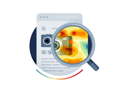
How Does A Heatmap Tool Work?
A heatmap is a tool for customer behavior analytics on a website. By using this tool you can learn more about how users interact with your website. You are able to analyze lots of characteristics of your potential customers. For example, where they click, what are the most interesting parts for them, and how far they scroll down. You can even understand why customers leave your website. By reorganizing the pages according to the results of the heatmap, you can slightly boost your website’s conversion rate.
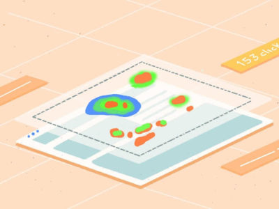
A heatmap works based on collected data. It gives a color-coded representation with a dark-to-light color scale. In this way, the most and least interacted components of the website get identified. The most interacted parts are marked with warmer colors and the least interacted ones with colder colors. You get the final result as an image that sums up your website’s data. All in all, the heatmap displays the value of the content.
Since a heatmap shows the value of the content, it is considered to be a qualitative analytics tool. It gives you relevant information about the behavior of your customers. You can observe their individual interactions.
How To Use The Heatmap Tool?
With the use of a heatmap, you can study whether the visitors get in touch with the most important content. Reveal whether users click on every button on the page or are there any non-clickable ones. You can also check if users recognize the call to action and how they react to them. It also helps you to see what should be improved on your website. A heatmap can detect what catches the attention of the users and what they ignore. By identifying the overlooked elements on your website, you’ll get the chance to replace them. Fill those gaps with content that is popular according to the heatmap. You can also test further the uninteresting parts to understand what is missing about them.
For example, if you are a content website like LuckyMag and using a call to action across your content pieces, i.e., under relevant headings and conclusion, the heatmap can help you understand which CTA is getting the most clicks and how you can improve the other ones.
There are two types of heatmaps, the static and the dynamic ones. Static heatmaps are suitable for the analysis of static web pages, like the home page or the blog. Dynamic heatmaps are able to study more complicated processes. These ones are usually used for e-commerce websites to test live pages, such as charts or order history. Altogether, dynamic heatmaps are good for collecting data from pages that can be changed by the user personally.
If you are running an e-commerce website, a heatmap seems to be good to analyze the whole shopping process. In this way, you can understand what makes the deal and breaks the deal for your business. By developing the deal-breaking parts, you can definitely boost the conversion rate of your webshop. The heatmap fits well for the examination of the changes in the chart or viewed products. You can observe lots of ways of customers’ behavior. Identify the products that are often put in the basket but removed before checkout. Look whether users scroll through all the product pages or stop at a certain point. With the help of a heatmap, you can reveal defects that you’ve never thought about. Some of them might be easy to correct.
Web Design According To The Heatmap
In the case of analytics done with heatmap, all clicks are connected with a spot on the website. The one that gets the most clicks, is the most valuable one. According to the number of clicks, it is the most attractive position on that website. This means that it is recommended to put the most important information in that position. Try to find the place of each website element in keeping with the value of each spot. The more value a spot has, the more significant information has to be inserted into it. All these steps make your website more user-friendly. Information is going to be found where users are likely to look for it. Getting the information swiftly can extremely improve the user experience.
When it comes to web design, go over the benefits of using ready-made website templates or creating one by yourself. With ready-made solutions, you can only put each element where it is determined to be by the template. It is good when all these spots match the hottest ones according to the heatmap. But it can lead to a huge failure when the template puts the important information into less attractive spots. In this case, you can build your own web design. The benefit of this method is definitely that you can find the place of each component by yourself. You can plan the whole structure corresponding to the results of the heatmap. Thus it will be made sure that the most important information will not slip the users’ attention.
 Place the elements that contain useful pieces of information or call to action, in the position that has a higher value. The positions that are less visited, keep for design elements and additional information. If you have something special to share with your visitors, find a place for that in one of the hottest spots. For instance, sales or new products can be discovered more easily in this way. By following these steps, you can guarantee that the important information will get to the potential clients. They will be more likely to click on buttons and follow calls to action. Generally, they will spend more time browsing your website. There will always be something that catches their attention and makes them visit new pages again and again.
 Some Extra Tips
While doing heatmap analytics, make sure that all the user behavior data is protected. To keep the privacy of the end-users, ensure that all the customers’ data is anonymized. User experience can be really messed up when statistical data gets used for other purposes. For example, someone who has just visited your website without doing any interaction with it accidentally gets newsletters from you. Always control whether the collected data is only used for statistical purposes.
Using the heatmap tool itself can not reveal every strength and weakness of your website. It works the best together with other analytics tools, such as session replay or event analytics. Customers’ behavior is a complex thing that is sometimes hard to explain. The best is putting together all the results of various analytics tools and reorganizing your website according to that.
 A Website That Is Using The Heatmap Successfully
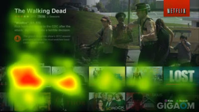
Netflix has definitely done heatmap analysis before setting up its website’s structure. Netflix observed its users streaming interests with the help of the heatmap tool. Through that, the preferred kind of shows and movie genres of each user got easily identified. Since that, all the users get personalized movie recommendations on their Netflix home page. Their favorite movies and TV shows appear right where they are most likely to click after entering their account. In such a way, each user gets the information displayed that they are more likely to interact with. The streaming service can really predict the popular content. You can see below a heatmap about an earlier Netflix structure.
 Source: https://www.narrativeindustries.com/2016/09/hidden-netflix-genres-paradox-choice/
