
When designing a comprehensive site strategy, there are a few foundational items to consider: a sound SEO strategy, rich content to keep users coming back and creating a simple, user-friendly experience. As the pandemic has driven more companies to go digital than ever before, there’s one marketing aspect that some tech-savvy designers miss: conversion rate optimization (CRO).
If your website, ads, and landing pages aren’t driving prospective customers to take action… what are they doing? Bringing traffic to your site is only step one in growing your business online, and your graphic design choices play a critical, and often overlooked, role in boosting conversions and helping you reach your sales goals.
While A/B testing is a cornerstone of successful CRO, timelines and budgets prevent many business owners from investing in the market research they need. Focusing on easy changes that have the potential to make a big difference can be a great way to increase conversions without breaking the bank. Even if you aren’t a designer, there are a few basic guidelines that can immediately improve your digital assets’ performance.
Let’s take a look at the power of:
- Gaze patterns
- Priority content placement
- Color psychology
- Accessibility
1. Gaze patterns
If your design includes images of other people, research on reading patterns and human psychology tells us that humans will instinctually follow another person’s gaze. Interestingly, this trait evolved as a survival mechanism for ancient humans, helping them stay aware of threats. While we don’t usually associate digital marketing with survival instincts, this trait does carry over into our modern daily habits. For example, take a look at these two heatmaps of ads featuring a baby:

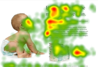
Image Source: https://www.nickkolenda.com/advertising-psychology/#ad-characteristics-t3
In the first image, all of the viewer’s attention is drawn to the baby’s eyes looking straight out at them – and not at the important copy that you’d like them to be looking at. In the second image, the viewer follows the baby’s gaze toward the content and spends most of their time reading (instead of staring at the cute baby!).
In conclusion: make sure human figures in your design are looking where you want your prospects to look. When thinking about conversions, their gaze should point at your CTA to encourage action through basic human instinct.
2. Priority content placement
It all comes back to the eyes. Our eyes are automatically attracted to certain features or points of interest, and the good news for marketers is that this is predictable throughout communities. You should place high-priority content in the areas most visually high-trafficked areas of a page.
Research shows that there are two main eye patterns followed by most Western readers: the “Z” and the “F” pattern.
In the “F” pattern, the reader first looks at the top left section of the page, then jumps to the top right, and then continues scanning vertically down the page. This is most typical for text-heavy websites or articles, and
guess what: when we say scan, we mean scan. The reader is most likely not going to read every word on the page – so put your most important content right where they’ll see it. Use headers and bullet-points in key places to communicate main ideas and inspire action.
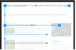
Image source: https://webdesign.tutsplus.com/articles/understanding-the-f-layout-in-web-design–webdesign-687
In the “Z” pattern, we see how users react when encountering a page with very little text. The reader will still start with a horizontal scan across the top, then jumps down to the bottom left and repeats the horizontal scan all the way across the page. For a page like this, you can use simple imagery and CTAs to make each of these 4 viewpoints work for you and drive quick conversions.
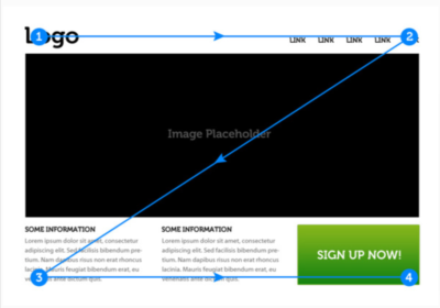
Image source: https://webdesign.tutsplus.com/articles/understanding-the-z-layout-in-web-design–webdesign-28
Now that you know where your prospects are looking, you can make sure they see your most vital content. Remember that these patterns are just guidelines, not templates, and that they can repeat themselves as the user scrolls down a page. Suppose your industry already has an established norm for content organization and page design. In that case, there’s no need to push the envelope too much, unless you’re trying to appeal to a unique audience that would be attracted to something out-of-the-ordinary.
3. Color psychology
The psychology and meanings behind the use of different colors has been around since Michaelangelo was painting the Sistine Chapel – and there’s no need for you to re-invent the wheel. People respond to colors in specific ways, and we’re pretty aware of what those are. Use resources like this article on logo design and this blog on the meaning of color to determine how color could best elevate your brand and drive action from your customers.
For example, take a look at this infographic on the emotional impact of color.
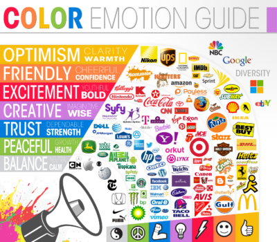
Image source: https://thelogocompany.net/psychology-of-color-in-logo-design/
Look at the brands above, and consider how they embody the colors they’ve chosen to represent their business. To take your research a bit further, visit a few of these companies’ websites, and see how they use consistent, intentional colors to build relationships with their audience.
When designing an ad or a landing page, think about what will motivate a prospect to convert. Will a warm, yellow & green background help them feel comfortable signing up for a service? Do you want to excite visitors with red accents? It’s also essential to acknowledge that many of the brands on this chart serve a Western audience and that culture can play an important role in determining a color’s significance.
For example, black and white have almost opposite meanings when you compare Western and Eastern culture. In North America and Europe, black often represents death, sadness, or mourning, while several Asian cultures use the color white to represent death. Chinese culture uses the color black to signify prosperity and health, while Western culture often chooses white to signal happiness, peace, and holiness.
Review your existing digital assets, and ask yourself if your color choices are working for you or against you. Leverage the psychology of color to boost the power of your marketing tools by connecting with your audience on an emotional level.
4. Accessibility
To optimize conversions, users of differing abilities should all be able to understand and access your content easily. A few important considerations:
- Avoid red text. It’s difficult to read and could be literally impossible to read for someone with color-blindness. Instead, use red iconography or alert boxes to grab attention.
- Consider color-blind users. You can use tools like this one to simulate your design as it would appear to a person with different types of color-blindness. Be sure that color isn’t the only tool you’re using to convey meaning; when you take the color away, does your content still have value? Try using this Chrome extension to see if your design meets a person with color-blindness’s needs.
- Provide sufficient contrast & sizing. Text should easily stand out from its background and be large enough that readers can recognize it without difficulty.
- Create a responsive design. Your design should be formatted for mobile viewing, as it’s likely that a large percentage of your audience will interact with your brand on a mobile device.
- Use different types of CTAs. GIFs, QR codes (generated via a QR code generator), etc. This will help figure out what works and what does not.
5. Extra tips for non-designers
Keep it simple
The best digital content is compelling and to the point, and so are great designs. Landing pages, ads, and e-mails all follow the same basic rule: satisfy searcher intent with valuable, accessible content. Don’t go over the top with a cluttered design that keeps users from seeing priority content and quickly taking action. If your message is too complicated, you are guaranteed to lose customers who aren’t interested in completing a scavenger hunt to find meaning on your page.
Focus on your outline
Consider this: if a user only saw your headlines, would you be getting your point across? What if they could only view the outline version of your content? With a well-organized design, you should be communicating your key ideas with minimal copy and a clear CTA – the rest is just gravy on top. Maybe your headlines wouldn’t be enough to convince someone to give you their precious e-mail address for future contact, but they should always provide a good idea of who you are and what your brand does.
Pick, and prioritize, a primary CTA
While there may be several actions a user can take when navigating an entire website, you should have identified a clear CTA on a digital ad or landing page that all users are pushed toward. When adding a design element, consider whether it is supporting or detracting from your main goal. For example, if your goal is for the user to sign up for an e-newsletter, will a cool, but distracting, giant gradient header help them do that? No? Then out it goes. Emphasize your benefits and use those to guide users to your primary action.
Using these strategies, even non-designers can make easy, fast updates to digital asset design that increase the likelihood of conversions and build audience relationships. If you take these steps and decide you’re ready to move on to A/B testing, check out Google Optimize for an easy-to-use and free toolset to set up your tests. This tutorial is a great introduction to using the platform. Now let’s see you stand up to competitors by optimizing your graphic design for better CRO!